Content from Introduction to the BBBC021 dataset
Last updated on 2026-03-31 | Edit this page
Overview
Questions
- What is the BBBC021 dataset?
Objectives
- Get an overview of the research question behind BBBC021.
- Understand the file structure.
The example dataset BBBC021
Welcome! For the next exercise we will use a compact, well-studied image set pulled from the Broad Bioimage Benchmark Collection (BBBC). The collection we are using is BBBC021, which contains images of MCF7 breast cancer cells treated with a panel of compounds. You can browse the full dataset here: https://bbbc.broadinstitute.org/BBBC021.
Why this dataset? Firstly, it is real experimental data used to discover which compounds change cell morphology and to cluster compounds by the pathways they perturb. Secondly, it is small and clean enough for hands-on learning, but biologically rich, so the analyses you build here translate to real research problems.
What did the experiment involve?
- Cells: MCF7 (human breast cancer cell line)
- Perturbations: 112 small molecules + DMSO control at multiple concentrations (we will use just two wells for the workshop)
- Stains (channels):
- DAPI: stains DNA / nuclei (channel1)
- Phalloidin: stains f‑actin (channel2)
- Anti‑β‑tubulin antibody: stains microtubules (channel3)
In this workshop, we will focus on comparing cells treated with DMSO to those treated with cytochalasin D (cytoD). It is a classic actin‑disrupting drug. When actin polymerization is disrupted you often see cells lose their spread morphology, change shape, and show altered phalloidin signal. That makes this a great case study for image‑based phenotyping.
Challenge
Given what you know about the dataset so far, can you formulate a research question? Try thinking about questions we may be able to answer using the images.
One option is: does cytochalasin D induce a morphological change in MCF7 cells?
But note that other questions may be interesting too! For example: does cytoD induce cell death?
Files and Metadata
Filenames contain the experimental metadata so you do not need a
separate spreadsheet. For example, the file name
cytoD_B07_s1_channel1.tif can be read as
- Treatment: cytoD
- Well: B07
- Site: s1 (image field within the well)
- Channel: channel1 (DAPI in this dataset)
Downloading sample data
If you have not yet done so, you will need to download the dataset now. Click on the button below and unzip the archive to a convenient location on your computer.
Next steps
Ready to build the analysis pipeline? Proceed to the next section to open these images in CellProfiler and start measuring the features that will answer our question.
- BBBC021 is a high-content imaging dataset of MCF7 cells.
- File names contain information about treatments and experimental parameters.
Content from Reading images
Last updated on 2026-03-31 | Edit this page
Overview
Questions
- How do we get started in CellProfiler?
- How do we teach CellProfiler the structure of our images?
Objectives
- Load images in CellProfiler.
- Understand modules for data loading.
Understanding preprocessing modules
There are four modules that CellProfiler always uses. In this episode, we will go through each and show what they are used for.
Images
Before we can get started with analyzing our images in CellProfiler, we need to load them in. Start CellProfiler and see whether you can figure out how!
Load the images into CellProfiler
Open CellProfiler and try loading the images into CellProfiler.
You can drag and drop the two folders, DMSO and
cytoD_0.1, onto the white field in CellProfiler.
Afterwards, it should look something like this: 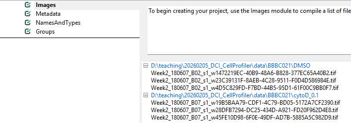
Now that CellProfiler knows where to find our images, we have to tell it a little bit about what is in the images.
Metadata
With the images loaded into CellProfiler, we can now start teaching CellProfiler what image belongs to which sample. For this, we use the Metadata module. This module’s purpose is to translate information that is captured in the file names into information that CellProfiler can understand.
Get started by clicking on yes for
Extract metadata?, upon which a menu should pop open. This
is what it looks like by default: 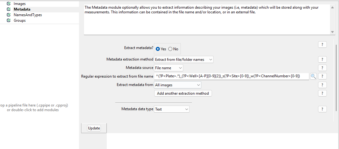
Now, we wish to inform CellProfiler about which image contains what.
To do so, set up the module as follows. 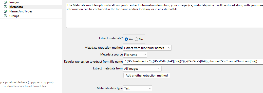
While this regular expression looks complicated, in general they can be crafted more easily using tools like regex101.com. Unfortunately, regular expressions are beyond the scope of this workshop, so feel free to just copy them from here:
^(?P<Treatment>.*)_(?P<Well>[A-P][0-9]{2})_s(?P<Site>[0-9])_channel(?P<ChannelNumber>[0-9])
What is happening here?
The images we are using have names like
cytoD_B07_s1_channel1.tif. We are trying to translate these
names into metadata with this awkward looking expression:
^(?P<Treatment>.*)_(?P<Well>[A-P][0-9]{2})_s(?P<Site>[0-9])_channel(?P<ChannelNumber>[0-9]).
This is an example of a regular expression. If you have not heard of regular expressions before, they represent a powerful way of pattern matching. Here, we use it to decode the file names.
You do not have to understand all the parts, but can you guess which part of the file name will match which part of the regular expression?
We can break up our file names by underscores. For example,
cytoD_B07_s1_channel1.tif can be read as
- Treatment:
cytoD - Well:
B07 - Site:
s1(site is the image number within a well) - Channel:
channel1
Using the regular expression, we can extract this information from each file name automatically, as long as it follows the same naming convention.
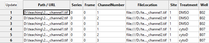
With this in hand, we can now translate the file names into metadata
that CellProfiler can understand. To see this in action, press the
Update button (top left in the below image), after which
you can see the new columns to the right containing information about
the imaging site, the week of the experiment, the imaged well, and
treatment used.
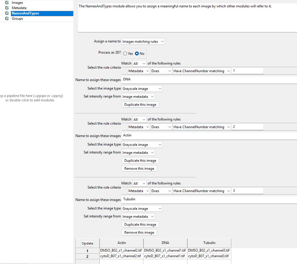
NamesAndTypes
This module allows us to rename channel numbers to stain names. Recall from the dataset introduction that our stains are for DNA, actin, and tubulin, imaged in the first, second, and third channel. To make our lives easier when working with CellProfiler, we therefore wish to rename the channels to the corresponding stains. This helps us later when we pick the stain to detect cells from.
If you are working on this workshop as part of our CellProfiler
course, you will have done this yesterday, in which case: give it a go
yourself! But if this is the first time you encounter the
NamesAndTypes module, click on the spoiler below.
The NamedAndTypes module tells CellProfiler which
channel belongs to which stain. Opening the module, we can see the
following defaults: 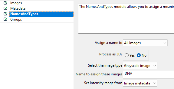
Recall that in the Metadata module we extracted the
channel number. We can now make use of this information to assign stain
names to the images. To do so, we switch the Assign a name
to Images matching rules (see below) and then assign the
channels to names. You will have to click Add another image
to add a new stain name, filling out the information as in the
screenshot and then clicking Update.
Groups
You can leave this module untouched for now. It is intended to further group images by experimental units, such as batches, plates, etc. Here, we only have two sets of images and do not need the additional grouping.
Conclusions
To summarize, the preprocessing modules do not make any changes to the images, but instead translate file and folder names into structures CellProfiler can understand. As we will see in the next tutorial, this will be useful once we start working with the images in CellProfiler to do things like detecting cell boundaries and measure fluorescence intensity. If you have made it this far - well done! It can feel a bit overwhelming to get started with CellProfiler and to have it set up properly, but now that we have it in place we can finally launch into our analysis.
- Load images by dragging/dropping them onto CellProfiler’s
Imagesmodule - The
Metadatamodule translates file names to extract metadata from file names, which will be saved along with your measurements. - The
NamesAndTypesmodule converts image names to meaningful names to be used within CellProfiler.
Content from Identifying primary objects
Last updated on 2026-03-31 | Edit this page
Overview
Questions
- How does CellProfiler identify objects in an image?
- Why do we usually start segmentation with nuclei?
- Which parameters matter most for good nucleus segmentation?
Objectives
- Understand what primary objects are in CellProfiler.
- Configure the IdentifyPrimaryObjects module to segment nuclei.
- Learn how to assess segmentation quality using the Test Mode viewer.
- Produce a nucleus object set suitable for downstream cell/feature analysis.
Introduction: why segment nuclei first?
In this episode, we will segment nuclei as our primary objects. In many microscopy assays, nuclei are an ideal starting point because they are:
- High contrast in a DNA channel (bright nuclei on a dark background), making them easier to separate from non-cell regions.
- Present in (almost) every cell, giving a reliable “anchor” object for counting cells and linking measurements.
- Typically compact and well-defined, which helps the segmentation algorithm succeed even when cell boundaries are faint.
Once nuclei are correctly identified, we can often use them to guide later steps like finding whole cells (secondary objects) or cytoplasm (tertiary objects), and to compute per-cell measurements.
In CellProfiler’s terminology:
- Primary objects are detected directly from an image (here: nuclei from the DNA channel).
- Secondary objects are grown out from primary objects (often whole cells).
- Tertiary objects are derived from other objects (often cytoplasm = cell minus nucleus).
The IdentifyPrimaryObjects module
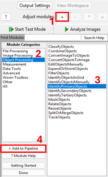
Add a new module via + Add → Object Processing → IdentifyPrimaryObjects.
You should now see a module where you need to specify:
- which image to segment,
- what to call the resulting objects,
- how CellProfiler should separate touching nuclei,
- what size and shape constraints to apply,
- and (optionally) how to filter out artifacts.
Step 1: choose the correct input image
Set Select the input image to the DNA/nuclear stain
image (i.e. DNA, if you followed the steps in the previous episode).
Set Name the primary objects to be identified to
something descriptive like Nuclei.
Confirm you are using the correct channel
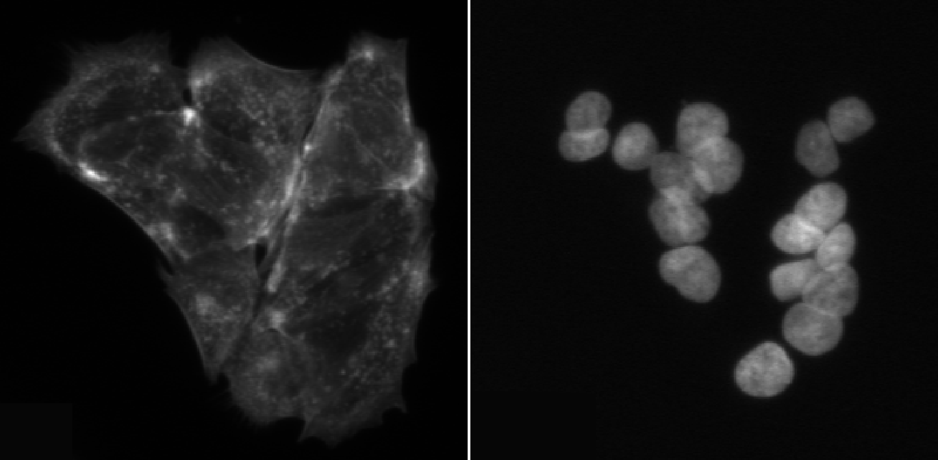
How can you quickly verify that you selected the DNA image (and not actin or tubulin)?
Using interactive test mode
One way to verify the image that is being segmented is to use
CellProfiler’s interactive test interface. To do this, first make sure
the eye symbol next to the module is enabled (dark). If it is a disabled
(light grey), click on the eye (step 1 in the figure below). Second,
start test mode and run the first step. A new CellProfiler window will
open, that shows the image that is being segmented next to the
segmentation results. Do the objects in the top left image look like
nuclei? You can zoom in using the magnifying glass (step 4 in figure).
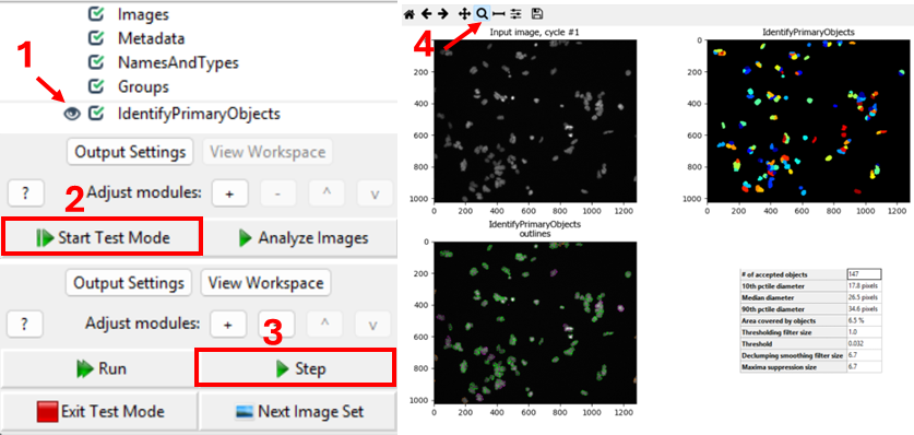
Nuclei should show as compact, round, and high-contrast objects, as
in the figure above. If you get a different result, make sure to
double-check your settings for the IdentifyPrimaryObjects
and Metadata modules.
Step 2: set an expected nucleus diameter (in pixels)
CellProfiler needs an approximate size range for objects. Set
Typical diameter of objects, in pixel units (Min, Max) to a
range that matches your nuclei.
This is one of the most important parameters. If the minimum is too small, you may pick up noise; if the maximum is too small, large nuclei may be split.
Estimate nucleus size
Using a representative image, estimate a reasonable nucleus diameter range.
To estimate nuclei size range, it is good to measure the diameter of a few nuclei in a representative image. We can do so by using the measure tool in CellProfiler. From the test interface used in the previous challenge, we can access the measure tool (step 1 in figure). Then, by clicking and dragging the cursor (2), we can measure the length in pixels, which is displayed in the bottom right of the window (3). By repeating this process for a few nuclei, ideally across a few images, we can gain a good intuition for typical nuclei diameters.
In this dataset, you could use lower bounds of 10-20 pixels, and upper bounds of 40-70 pixels, for example.
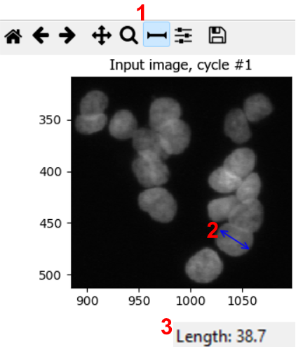
Note: in bigger experiments, this should be repeated with different experimental conditions to make sure we are not biasing analyses.
Step 3: choose a thresholding strategy (foreground vs background)
CellProfiler separates nuclei (foreground) from background using a
threshold. In the advanced settings of
IdentifyPrimaryObjects, you have the choice of two
threshold strategies:
- Global thresholding (one threshold per image)
- Adaptive thresholding (threshold varies across the image)
Set the thresholding method appropriate for your images. If illumination is uneven or background varies strongly, adaptive methods often perform better.
Compare thresholding options
Run the module in Test Mode on 2–3 images and compare at least two thresholding settings. Look out for things like
- Nuclei being merged or split (over- and undersegmentation)
- Background being included in foreground
Which setting best matches what you consider nuclei?
Note that CellProfiler colors nuclei it will remove in subsequent analyses in purple outlines. These nuclei are removed because they either do not fit the set diameter range. Nuclei that will be kept are outlined in green.
In this dataset, as if often the case, it is difficult finding
perfect settings! Ideally, one spends a significant portion of time
optimizing the settings to make sure that results are biologically
representative of cells. In the figure below, you can see that changing
the segmentation strategy and method to Adaptive and
Otsu, respectively, may not make much of a difference. But
results of the segmentation with adaptive Otsu show that some pixels
that are parts of nuclei are discarded (top right). Note that the result
will also be affected by the settings we will change next. 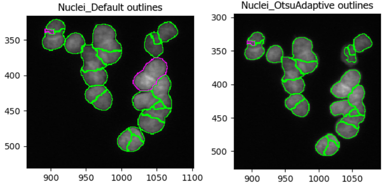
The images we use in this workshop are illuminated fairly evenly, meaning that nuclei show up in roughly equal brightness no matter where they are in the image. If you would like to see an example of uneven illumination, for which adaptive segmentation is a lot more important, on real images then watch this video: https://www.youtube.com/watch?v=ynrPqsOZVYE
Step 4: declump touching nuclei
Nuclei often touch or overlap, particular if many cells were seeded. While a z-stack (3D slices) of images can help distinguish which nuclei goes where, due to the increased imaging time needed and more complex downstream analysis not all experiments involve z-stacks. Instead, we can instruct CellProfiler to separate clumped nuclei using information about nuclei shape and intensity.
Tune declumping
Find an image region with several touching nuclei. (In the sample data, the image of cells treated with cytoD has more clumped nuclei.) Adjust declumping parameters until most nuclei are separated correctly.
As before, it is not trivial to find ideal declumping settings. We
can get satisfactory results using Shape for both,
distinguishing clumped objects and drawing dividing lines here, but note
that this will differ for each dataset and should be carefully tested.
It might also be helpful to set
Automatically calculate size of smoothing filter for declumping
to No and playing with the
Suppress local maxima that are closer than this minimum allowed distance
parameter.
This figure shows the impact of not using declumping at all (left) vs
declumping using Shape (right). 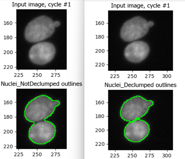
Step 5 (optional): filter cells
Depending on your dataset, you may need to exclude:
- tiny bright specks (dust/hot pixels),
- very large blobs (out-of-focus regions),
- edge artifacts.
Within IdentifyPrimaryObjects, you can handle some of this using:
- size constraints (min/max diameter),
- smoothing of the image before thresholding,
- discard objects touching the image border (if appropriate).
Discuss: should we exclude border objects?
With your neighbor, discuss whether nuclei touching the image border should be kept or removed for your research question formulated in the previous section, e.g. “does cytochalasin D induce a morphological change in MCF7 cells?”
In most cases we advise removing cells touching the image border, because they will represent outliers when we move to measuring cell characteristics. For example, they may appear as disproportionately small cells because they were cut off. This does not represent biological changes but technical parameters, which we are not interested in during the analysis.
Conclusions
Segmentation is rarely perfect, but it should be fit for purpose. A good nucleus segmentation typically has:
- Most nuclei detected (i.e. nuclei do not get missed)
- Few background objects detected
- Reasonable splitting of touching nuclei
- Consistent performance across conditions (e.g. DMSO vs treatment)
Now that we have Nuclei objects, we can detect whole
cells, an important step towards measuring features per cell! Therefore,
in the next episode we will use the nuclei as anchors to find cell
boundaries.
Help
Did you get stuck with one of the steps? Download a working version of the pipeline here:
If you are using Firefox, you have to right click the button and
select Save Link As....
After downloading the pipeline, you can compare it to yours for
troubleshooting. To do so, first open a new CellProfiler window
(File > New Project). Then, import this pipeline in
CellProfiler by clicking on File > Import
> Pipeline from File.
- Nuclei are often the best primary objects because they have high contrast and exist in nearly all cells.
- The most important parameters in IdentifyPrimaryObjects are object size, thresholding method, and declumping.
- Always test segmentation on multiple images and across experimental conditions.
Content from Identifying secondary & tertiary objects
Last updated on 2026-03-31 | Edit this page
Overview
Questions
- How can we detect whole cells once we have identified nuclei?
- What is the differences between detecting primary, secondary, and tertiary objects?
Objectives
- Use IdentifySecondaryObjects to segment whole cells from an actin image.
- Understand how secondary objects depend on primary objects.
- Learn how propagation-based segmentation expands from nuclei to cell edges.
- Create a cell object set suitable for per-cell measurements.
- Use IdentifyTertiaryObjects to create cytoplasm masks.
From nuclei to whole cells
In the previous section, we identified nuclei as primary objects. This gives us “seed” objects: one nucleus per cell.
However, many biologically interesting measurements (e.g. cell area, shape and cytoplasmic fluorescence) require us to segment the whole cell. This is often more challenging than nuclei segmentation because:
- cytoplasm and boundaries can be fainter than nuclei,
- neighboring cells may touch or overlap,
- staining can be uneven across the cell body.
To tackle this, CellProfiler provides
IdentifySecondaryObjects, which grows secondary objects
outward from nuclei using information from another image (here an actin
channel). This approach helps prevent ambiguous assignments of boundary
pixels by ensuring each cell is linked to exactly one starting
nucleus.
The IdentifySecondaryObjects module
Add a new module via + Add → Object Processing → IdentifySecondaryObjects.
You should now see a module where you need to specify:
- which primary objects act as “seeds” (nuclei),
- which image contains cell boundary information (actin),
- how to determine where each cell ends (thresholding + method),
- how to handle cells touching the image border.
Step 1: choose primary input objects
Set Select the input objects (or similarly named
setting) to Nuclei or the name you set in the previous
lesson. This tells CellProfiler that each cell object should be grown
outward from one nucleus.
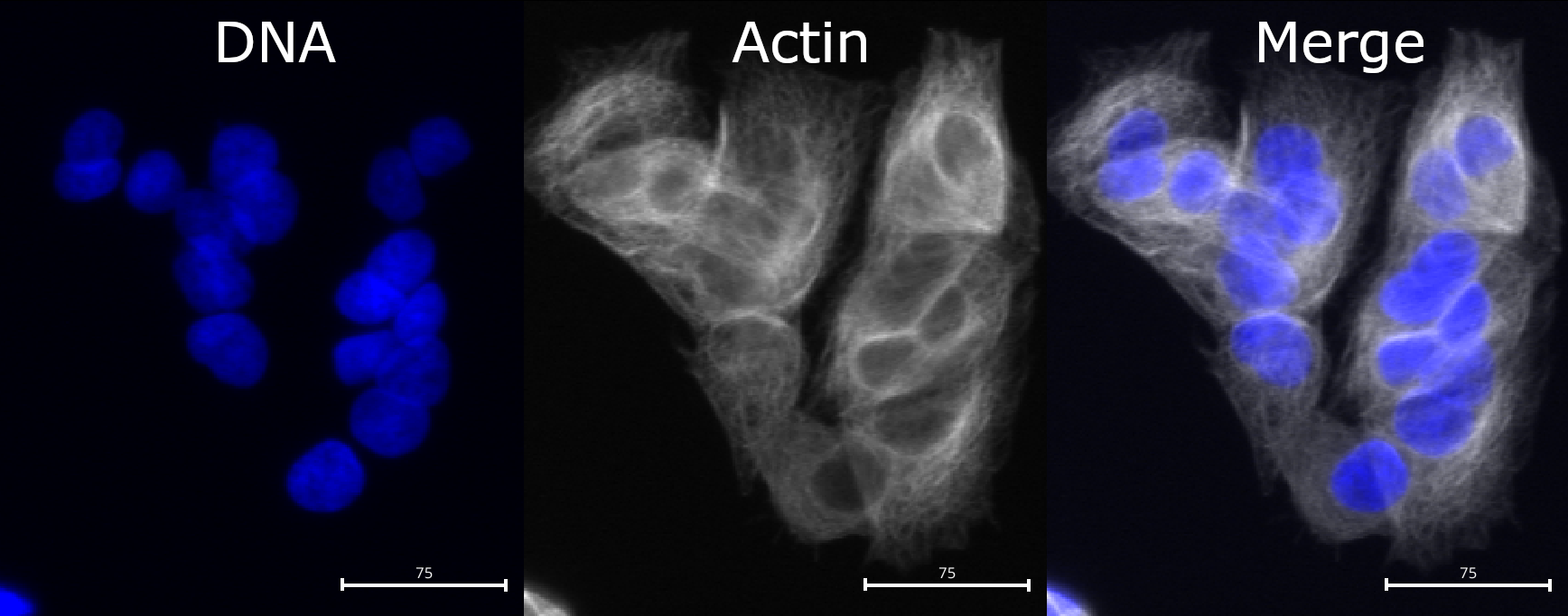
Step 2: choose the correct input image (actin)
Set Select the input image to your actin (or
cytoplasmic) channel, e.g. Actin (or whatever name you
assigned in NamesAndTypes).
The channel should contain relatively strong signal across the cell body and/or along the cell boundary.
Checking the actin image
Using Test Mode, inspect a few images:
- Can you see whole cell bodies?
- Are neighboring cells separable?
- Is the background reasonably dark?
If not, what issues do you observe?
If you find the contrast too dim to see the channel well, you can
increase the contrast. You can do so either by right clicking >
Adjust Contrast, or by selecting
Subplots > (Object name) outlines > Adjust Contrast.
Then, select Log normalized and a
normalization factor that you deem suitable, the click
Apply to all. 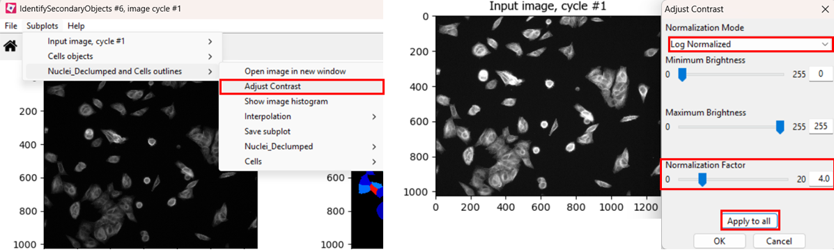
Compared to nuclei, cell boundaries are often less easily
distinguished. We can see that the actin channel does increase at cell
junctions, which should help in segmenting the cells in later steps. But
it is important to keep in mind that any segmentation will not be
perfect here: after all, where would you draw the boundaries by hand?
Step 3: choose a method to identify secondary objects
Now we will use IdentifySecondaryObjects to segment
cells. Many of the options are the same as in
IdentifyPrimaryObjects, but the most important difference
is the presence of
Select the method to identify the secondary objects option.
We encourage you to read their descriptions in CellProfiler by clicking
the ? symbol, but most often it is set to
Propagation. To see why, let’s see what happens when we try
segmenting cells with either method!
Optional challenge: explore methods
Try two different methods (e.g. propagation vs watershed gradient). How do the resulting cell boundaries differ?
As with the segmentation of nuclei, getting cell segmentation right
can be tricky. Often, starting with propagation as method
is a good starting point, because watershed can expand into neighboring
cells (see below). But you can certainly find areas of the image where
the reverse is true. This means that, once again, choices should be made
carefully. 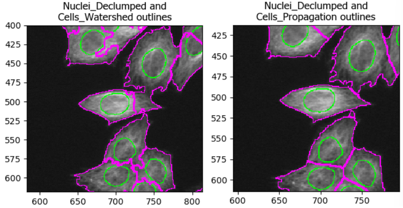
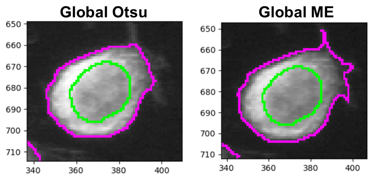
Step 4: choose a threshold strategy and threshold method
Much like when segmenting nuclei, the
IdentifySecondaryObjects module allows us to fine-tune our
segmentation by changing the thresholding strategy and method. As
before, the best choice depends on illumination and staining
consistency. While Minimum Cross-Entropy (right) is the
default thresholding method, Otsu (left) can often also
yield good masks and makes a bit fewer assumptions about your image. For
this dataset they perform very similarly, except that Minimum
Cross-Entropy does slightly better at detecting protrusions such as in
the below image.
Challenge: biological pitfalls
Think about the assumptions CellProfiler is making in its identification of secondary objects. Can you think of biological samples where these assumptions may not be met? Discuss with your neighbor.
CellProfiler identifies cells by expanding outwards from a nucleus. This assumes that each cell only has exactly one nucleus in the same plane. When imaging hepatocytes, for example, this can prove problematic: they often contain more than one nucleus. Equally, if we were imaging cells in suspension, we would have to make sure than we capture the nucleus accurately in 3D and expand the cell in 3D space too. And lastly, red blood cells do not even have a nucleus, so this method would not work for them either!
Other pitfalls include mitotic/meiotic cells: from when on do we term a splitting cell as two cells? When the two nuclei have budded off, or when the membrane is fully split? CellProfiler cannot answer these questions for us, instead, we must consider these biological complexities when designing our analysis pipeline to not yield nonsensical data down the line.
Once you are happy with the result, make sure to check the following options:
- Fill holes in identified objects: Yes
- Discard secondary objects touching the border of the image: Yes
- Discard the associated primary objects: Yes
And finally, name the new primary objects thus filtered,
e.g. Nuclei_Filtered.
Identifying cytoplasm
You have now created whole-cell objects from nuclei seeds and an actin image. Well done! 🎉
With nuclei and cells in hand, we can create one last object: the cytoplasm. Fortunately, this one is easy:
Cytoplasm = Cell - Nucleus
To do this, add the IdentifyTertiaryObjects module and
select what you think are the correct options.
- Larger objects: cells identified with
IdentifySecondaryObjects - Smaller objects: nuclei filtered in
IdentifySecondaryObjects - Name: e.g.
Cytoplasm - Shrink smaller object prior to subtraction:
Yes(default)
Conclusions
Finally, we have created all masks we need and can move on to measure things!
Help
Did you get stuck with one of the steps? Download a working version of the pipeline here:
If you are using Firefox, you have to right click the button and
select Save Link As....
After downloading the pipeline, you can compare it to yours for
troubleshooting. To do so, first open a new CellProfiler window. Then,
import this pipeline in CellProfiler by clicking on File
> Import > Pipeline from File.
- Secondary objects (cells) are typically grown from primary objects (nuclei) using a cytoplasmic/cell-boundary stain (here: actin).
- Filtering border-touching nuclei helps avoid partial cells and misleading measurements.
- The most important settings in IdentifySecondaryObjects are the identification method and thresholding choices, which strongly affect whether cells merge or fragment.
- Tertiary objects (cytoplasm) are a subtraction of nuclei from the cell mask.
Content from Measuring object intensity and shape
Last updated on 2026-03-31 | Edit this page
Overview
Questions
- Once we have segmentation masks, what can CellProfiler measure from them?
- What is the difference between intensity measurements and shape measurements?
Objectives
- Use MeasureObjectIntensity to quantify fluorescence per nucleus, cell, and cytoplasm.
- Use MeasureObjectSizeShape to quantify area/shape descriptors for each object.
Measuring: turning segmentations into numbers
So far, we have been creating masks: pixels belonging to nuclei, cells, and cytoplasm. Masks are useful on their own for quality control, but the real power of CellProfiler is that it can turn masks into quantitative measurements.
In this episode, we will measure two broad classes of features:
-
Intensity features: “how bright is this object in a
given channel?”
- Example questions:
- Is actin intensity higher in treated cells?
- Do nuclei become brighter/dimmer in the DNA channel?
- Example questions:
-
Size and shape features: “what is the geometry of
this object?”
- Example questions:
- Do cells spread out or shrink?
- Do nuclei become larger or more elongated?
- Example questions:
MeasureObjectIntensity: measuring fluorescence per object
Add the MeasureObjectIntensity module to your
pipeline.
This module measures per-object intensity statistics for one or more images. For example, it can quantify the DNA stain in the nucleus, or the actin stain intensity in the cytoplasm.
Challenge
What channel should be measured in what part of the cell? For example, should we quantify DNA signal only in the nucleus, or everywhere (nucleus, cytoplasm, whole cell)? Discuss with your neighbor.
The simplest setup is to measure all channels in all parts of the cells and decide which measurements to interpret down the line. Perhaps surprisingly, this is the approach frequently chosen in high-throughput experiments: measure everything, ask questions later. And indeed, one can envision scenarios where measuring e.g. DNA in the cytoplasm may prove useful if DNA leaks through the nuclear envelope due to environmental stress.
That said, if you have a narrow research question and an idea of where to look for changes in cell morphology, then only measuring the correct combination of channel and cell components will be the right approach.
To set this up in CellProfiler, for
Select the objects to measure select:
Nuclei_FilteredCellsCytoplasm
Note: these names may differ, depending on what you called them in
previous modules. We will not use the nuclei created in
IdentifyPrimaryObjects, because we filtered them in
IdentifySecondaryObjects to only contain nuclei of cells
that are not touching the image boundary.
Then, select all channels in Select images to measure,
unless you would like to only measure some of the channels. Finally, run
the module in test mode and look at the output.
Challenge
Let’s see whether the DNA intensity is higher in the cytoplasm or the
nucleus. Using the table that the module outputs in test mode, look for
a row with DNA - Cytoplasm - MeanIntensity and read off the
value in the Mean column. Then repeat this for
DNA - Nuclei_Filtered - MeanIntensity. What do you
observe?
Depending on your segmentation settings and which image you are using to test, the mean DNA intensity is about 3-4x higher in nuclei than in the cytoplasm, as you would expect.
MeasureObjectSizeShape: measuring geometry
Beyond fluorescence intensities, it is common to measure shape descriptors of cells. Example measurements include:
- area
- perimeter
- eccentricity / elongation
- compactness
Once again, we add the module (MeasureObjectSizeShape)
and select our objects to measure in as before. For this workshop,
disable Zernike and advanced features, as they slow down CellProfiler,
which can be annoying while building the pipeline.
CellProfiler measures many things - including some with names that
most will never have heard of. The helps a lot with deciphering the
measurement names. For example, for eccentricity it
contains this helpful image:  Which shows that eccentricity will be higher for elongated cells.
Step 3: Sanity check measurements
When building a workflow, it is worthwhile checking outputs at each step. For measurements this can be a bit harder than with segmentation, but one of the things we can check is the cytoplasm/nucleus area ratio. We have now seen many example images of these MCF7 cells and could venture a guess that the cytoplasm occupies more space than the nuclei (in 2D).
Calculate the cytoplasm/nucleus ratio
Run the module in test mode and look for the Area
feature for Cytoplasm and Nuclei_Filtered (or
equivalent names in your pipeline). This feature describes the average
number of pixels occupied by the cytoplasm/nucleus. Now calculate the
ratio of the cytoplasm to nucleus area.
The cytoplasm occupies about 3-4x more space than the nucleus. Again, depending on your segmentation settings, your result may differ. This is in line with our observations from images of the cells.
Exporting measurements
So far we have created segmentation masks and computed measurements
(intensity and size/shape). To use these measurements outside
CellProfiler (e.g. in R, Python, or Excel), we need to export them to
files. One standard way to do this is the
ExportToSpreadsheet module.
Add the ExportToSpreadsheet module. For this workshop,
the default settings are fine. The most important thing is that:
- the module exports object-level measurements (for
Nuclei_Filtered,Cells, andCytoplasm), and - you need to know where the files are written to.
Challenge: export your measurements
- Add ExportToSpreadsheet at the end of your pipeline.
- Run the pipeline (not in test mode, but by clicking
Analyze images) - Find the exported files on disk.
Questions: - What file format(s) were produced
(e.g. .csv)? - Do you get separate files for
Nuclei_Filtered, Cells, and
Cytoplasm? - Open up one of the files. Can you identify at
least one column coming from intensity measurements and one coming from
shape measurements?
With default settings, CellProfiler typically exports one spreadsheet per object type (e.g. one for nuclei, one for cells, one for cytoplasm), plus one for image-level measurements if any were computed.
Open one of the exported spreadsheets and look for column names such as:
-
Intensity_MeanIntensity_*orIntensity_IntegratedIntensity_*(fromMeasureObjectIntensity) -
AreaShape_Area/AreaShape_Perimeter/AreaShape_Eccentricity(fromMeasureObjectSizeShape)
If you cannot find the files, check the
Output file location setting in
ExportToSpreadsheet and re-run the pipeline.
Tip: run on a subset first
When developing a pipeline, it’s often faster to run on a small subset of images first to confirm that exports look correct. Once you’re satisfied, run the pipeline on the full dataset. In this exercise, you have only been provided with a few images so this does not apply, but it will make a big difference when dealing with hundreds of images.
Conclusions
We have now added measurement modules to compute:
- per-object fluorescence intensities (per nucleus, cell, cytoplasm)
- per-object morphology features (size and shape)
These features are the raw material for downstream analyses like comparing treated vs control populations, building morphological profiles, or training classifiers.
Help
Did you get stuck with one of the steps? Download a working version of the pipeline here:
If you are using Firefox, you have to right click the button and
select Save Link As....
After downloading the pipeline, you can compare it to yours for
troubleshooting. To do so, first open a new CellProfiler window. Then,
import this pipeline in CellProfiler by clicking on File
> Import > Pipeline from File.
- MeasureObjectIntensity quantifies fluorescence per object; choose objects and channels deliberately.
- MeasureObjectSizeShape quantifies morphology; disable Zernike/advanced features to iterate faster.
Content from Reproducibility in CellProfiler
Last updated on 2026-03-31 | Edit this page
Overview
Questions
- What is the difference between saving a CellProfiler project and exporting a pipeline?
- Which approach is more portable across computers and collaborators?
Objectives
- Practice sharing both formats with a neighbor and observe what breaks.
- Verify reproducibility by comparing exported measurements.
A CellProfiler analysis is only useful if someone else (or future you) can reproduce it. In practice, “someone else” might be the person sitting next to you today, using a different computer with a different folder structure. But more generally, reproducibility is important at many stages: when you come back to your analysis two years later, when the next student wants to pick up the project, or when you publish your results. Reviewers may well demand access to the pipeline to see which steps were done to analyse images. So how do we share our workflow?
CellProfiler gives you two common ways to save your work:
Save Project captures your whole working session, including the image file list. This is convenient when you want to pause and continue later on the same computer.
Export Pipeline captures your analysis recipe (modules + settings), but not the image file list. Which one is better for sharing your workflow? Let’s find out!
Save your workflow in CellProfiler in both ways:
- File → Save Project
- File → Export → Pipeline
naming them with your name. Note the different file endings,
.cpproj for the former and .cppipe for the
latter.
Then share the file with your neighbor by following the instructions below.
You have a few options to quickly share your files. If you have a USB
stick with you, that may be the fastest option. But otherwise follow the
instructions under Online file share.
If you do not have a USB stick with you, we can use an online file sharing solution. You can use email/OneDrive/Dropbox/Google Drive if you like, or follow the instructions below if you do not want to create an account on a service.
- Both you and your neighbor should open https://toffeeshare.com
- You share one of the two files by clicking on the
+ . Note that toffeeshare only allows sharing
one file at a time. You can zip the two files to an archive to only
share one file if you prefer, in which case skip step 7.
. Note that toffeeshare only allows sharing
one file at a time. You can zip the two files to an archive to only
share one file if you prefer, in which case skip step 7. - Make sure to set the
Local sharing codeoption
- Your neighbor now clicks on
Nearby devicesin the top right - Then, they enter the share code displayed on your device.
- The download should start within ~10 seconds, make sure you both keep the window open in the meantime.
- Repeat 1-6 with the other file.
- Repeat 1-7 with your neighbor now sharing their files with you.
You should now have shared your workflows with each other, each having two files of the other:
- The pipeline file (
.cppipe) - The project file (
.cpproj)
Try to reproduce your neighbour’s results
Start with loading the project file into CellProfiler with File → Load Project. You may get a warning about version mismatches, this can usually be ignored but using the latest available version is advised.
Try going through the workflow. Does everything work as you would expect?
You can verify that you are getting the same results by looking at
the output of MeasureObjectIntensity in test mode and
comparing with each other.
The workflow should be reproducible, but you may encounter an issue:
the images loaded in with the Images module are not in the
same location on your computer. You will have to select and delete them
(right click > Remove From File List). Then, add the
images into CellProfiler again. Now run through the workflow.
As you may have noticed, most of the workflow was reproducible, but we had to switch out the images first. The other way of sharing a workflow avoids this.
In a new CellProfiler window (File > New Project), load in the
.cppipe file by using
File > Import > Pipeline From File. Load in the
images and go through the workflow again. You should notice that the
results remain unchanged.
Recall from episode 2 that we extract metadata from the file but not folder names in this exercise. This can differ between projects - for example, you may have a different folder for each day of imaging. In this case, you will need to reproduce the folder structure on the new PC before you will be able to run the pipeline.
Practical takeaways
When you want to continue your own work, saving the project is convenient.
When you want to share a reproducible analysis workflow, exporting the pipeline is usually the better default. If you share a pipeline, it is a good idea to also share some example images for testing. And of course for full reproducibility, you need to share all images.
- Save Project is great for restoring a full session, but often stores image paths that are not portable.
- Export/Import Pipeline is a more reproducible way to share an analysis workflow.
Content from Bonus: visualising features
Last updated on 2026-03-31 | Edit this page
Overview
Questions
- How do you read CellProfiler’s exports?
- What information can be gleamed from them?
Objectives
- Create a simple figure in Excel
- Using Morpheus to investigate how cytoD affects cell morphology
Finished with the previous steps already? Well done! In this episode we will dive into the data that CellProfiler outputs and start to get a feel for the problems we may face in analyzing it.
To start with, find the folder with the .csv files
created in the previous episode. There should be 5-6 files in the
folder, prefixed by whatever we set in the settings of the export
module.
-
Experiment.csvcontains basic information about the pipeline. -
Image.csvat its most basic just contains image indeces, although one can also export per-image features. - The remaining files are per-object, e.g.
Cells.csv. These represent features per single-cell and are perhaps the most interesting to analyse.
If you do not have an output file handy, you can download this one for the tutorial:
Open one of the files in Excel. Now we wish to check whether cytoD had any impact on cell morphology. Recall that cytoD is an actin inhibitor, so we may reasonably expect that cells will be smaller after treatment with cytoD.
Basic test of cell size in Excel
To test this, click on column “H” (Metadata_Treatment) to select it.
Then, while keeping the Ctrl key (Command ⌘ on Mac) pressed
, click on column “J” (AreaShape_Area). In the top, go to
Insert > Recommended charts and select the
top one (Clustered Column), then press Okay.
By default, this gives us a sum of pixels covered by cells in each
treatment. To change it to the more meaningful average (i.e. size of
cell on average per treatment), click on the graph, then in the bottom
right under Values click on the
Sum of AreaShape_Area, then
Value Field Settings. In the pop up window, select
Average and press Okay. What does the chart
show?
You should get a table and bar chart similar to this: 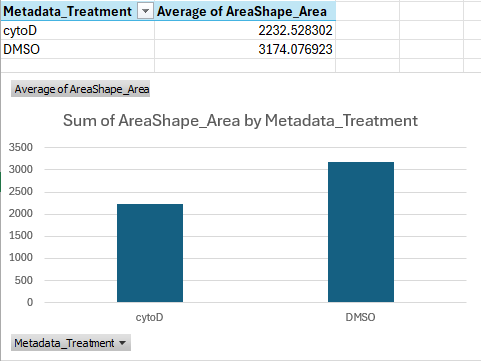
If we do the math, this shows that cells treated with cytoD are about ~30 percent points smaller than cells treated with DMSO only, on average.
This is a great start, we can see that our treatment is indeed having a quantifiable effect! But how can we check this for all features, ideally in an automated way? And how can we skip the averaging that Excel is doing here entirely, and cluster single-cells?
Advanced analysis
Depending on your expertise with programming, you have a few options. If you
- would like to just see a quick result, skip to the next section
- have experience in Python programming, use pycytominer, a Python package that can be used to the analyse morphological features.
- have no experience in Python yet but would like to learn, attend our future Python workshop!
- would like help to analyse your results in depth, contact us!
Analysis with Morpheus
One useful tool to visualize CellProfiler outputs is Morpheus: https://software.broadinstitute.org/morpheus/
Morpheus is a matrix visualization tool that can quickly cluster rows and columns.
To see it in action, first download the sample input below, which we created from a CellProfiler output. Note that CellProfiler output cannot be loaded into Morpheus straight, but requires some preprocessing, which in this case we did for you using Python.
Then open https://software.broadinstitute.org/morpheus/ and drop the file into Morpheus. You should now have a view like this:
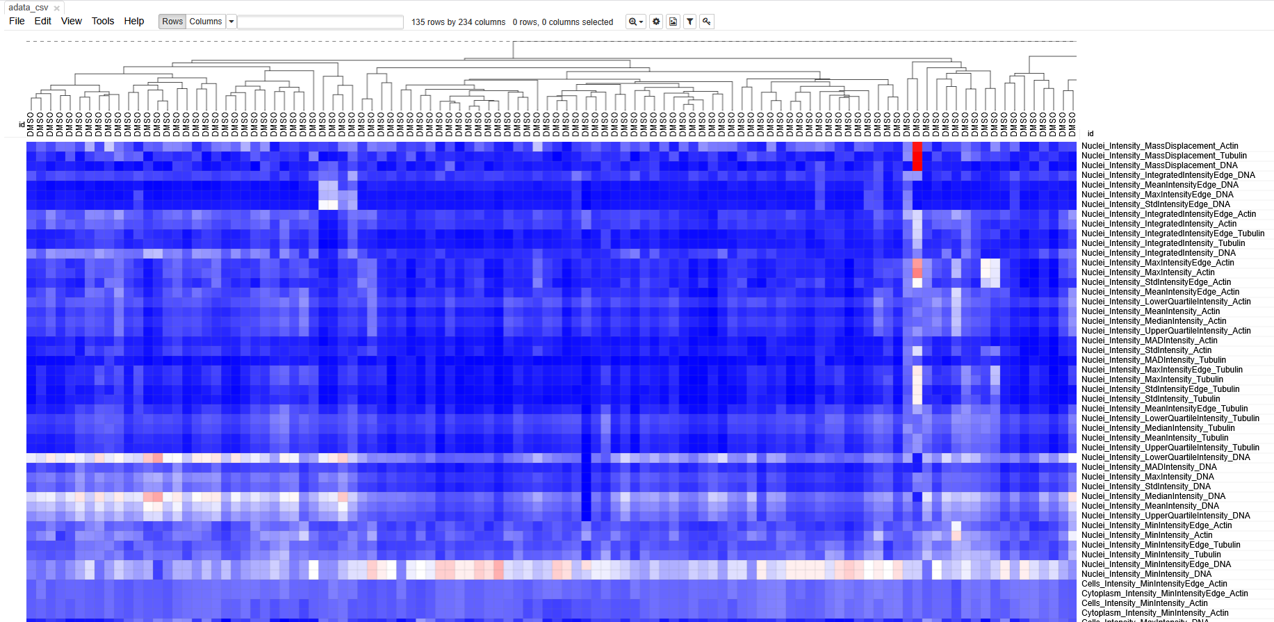 Each column represents measurements from a single cell. Each row
represents a measurement. The boxes are color coded by the feature value
for this cell (after some normalization). Cells (columns) are clustered
based on similarity to each other.
Each column represents measurements from a single cell. Each row
represents a measurement. The boxes are color coded by the feature value
for this cell (after some normalization). Cells (columns) are clustered
based on similarity to each other.
Spend some time getting acquainted with the interface. Can you identify which cells belonged to which treatment? Do the cells cluster separately? Which features seem to have changed after treatment with cytoD?
Unfortunately, preparing an input file for Morpheus is not very straightforward, because it involves some normalization and, in bigger experiments, batch correction steps. It would also not be suitable for experiments with more than a few hundred cells, because you will quickly lose sight of the large data.
Therefore, we recommend contacting DBI-INFRA if you would like to learn more:
- CellProfiler writes one
.csvper object type (i.e. Nuclei, Cells, Cytoplasm). - Exported files contain many columns with metadata.
- Morpheus can be useful to interrogate morphological changes.
Content from Advanced: classifying cells in CellProfiler Analyst
Last updated on 2026-03-31 | Edit this page
Overview
Questions
- How do you classify cells with CellProfiler Analyst?
- What files do you need to move from CellProfiler to CellProfiler Analyst?
- How can you tell whether your classifier is performing well?
Objectives
- Demonstrate how to export a database and properties file from CellProfiler.
- Walk through the CellProfiler Analyst interface (image viewing + classifier).
- Gain experience training and evaluating a simple phenotype classifier.
CellProfiler Analyst: an introduction
CellProfiler Analyst (CPA) is a companion tool to CellProfiler. While CellProfiler is used to segment objects and measure them, CPA is often used to explore those measurements and to classify cells into phenotypes (e.g. “healthy” vs “unhealthy”) using machine learning.
Why would we want to do this?
- You may want to scale up detection of a phenotype that is obvious to a human but hard to summarize with a single metric.
- You may want to identify rare events, like mitotic cells.
- You may want to find abnormal cell states, e.g. stressed or apoptotic cells.
How does CPA make predictions?
CPA uses features measured by CellProfiler to decide which phenotype
a cell exhibits. Note that this means that any work done in CPA is
heavily influenced by the features measured in CellProfiler: if we only
used the MeasureObjectSizeShape module while running
CellProfiler, then CPA will not be able to use any fluorescence
intensities to make classifications. It is therefore important that the
CellProfiler pipeline captures as much information as possible to
increase the chances of making accurate predictions using CPA.
CPA has rough edges
CPA is useful, but less actively developed than CellProfiler, and it can be “picky” about inputs. Today we will likely see at least one rough edge: CPA expects a clean 1-to-1 relationship between objects in the database (e.g. one cell ↔︎ one nucleus), but not all pipelines export perfectly into a CPA-friendly format without additional processing.
Preparation
Before proceeding, make sure you:
Install CellProfiler Analyst
Download and install CPA from: https://cellprofileranalyst.org/releases-
Download the additional sample data
- SQLite database: DefaultDB.db
- Properties file: DefaultDB_MyExpt.properties
First open of CellProfiler Analyst
CPA always needs a properties file to know:
- where your database lives,
- what tables/columns hold object measurements,
- where to find images.
Challenge: open CPA
- Launch CellProfiler Analyst.
- Don’t select anything yet—just observe what CPA asks you for.
What file does it require before you can do anything useful?
CPA requires a properties file
(.properties) that describes the database and how to
interpret it. You can generate this from CellProfiler
(ExportToDatabase), or use the pre-made one for this
workshop.
Creating CPA inputs from CellProfiler (ExportToDatabase)
CPA expects measurements in a database (often SQLite). CellProfiler can create this using the ExportToDatabase module.
This export is different from
ExportToSpreadsheet:
- ExportToSpreadsheet creates human-readable tables (CSV) that are great for R/Python/Excel.
- ExportToDatabase creates a database plus an optional CPA properties file that CPA can read.
Add and configure ExportToDatabase
In CellProfiler, add:
+ Add → File Processing → ExportToDatabase
Then adjust these settings:
-
Create a CellProfiler Analyst properties file? →
Yes -
Which objects should be used for locations →
Nuclei_Filtered -
Select the plate type →
384 -
Sekect the plate metadata →
Series -
Select the well metadata →
Well - Output file location → (choose an output folder you can find again)
Challenge: add ExportToDatabase and generate CPA files
- Add ExportToDatabase to the end of your pipeline.
- Configure it to generate a CPA properties file.
- Run your pipeline on a small subset of images.
- Locate the exported database (
.db) and the generated properties file (.properties).
Can you find both files on disk?
You should see a SQLite database file (.db) and a
.properties file in your chosen output folder. The
.properties file is what CPA opens. If you are struggling
to generate the right files, keep reading - you can use the provided
files for now.
Object relationships can break CPA
You may see a warning in CellProfiler’s ExportToDatabase module along the lines of:
“Cytoplasm is not in a 1:1 relationship with the other objects”
This typically happens when some objects were discarded (e.g. border filtering).
Fixing this properly often requires filtering or restructuring the tables in SQLite/Python, which is beyond today’s workshop (see below).
Using the provided database
While you can use the database you created above, it will lead to some issues in CellProfiler Analyst, because we removed cells touching the image border.
Instead, use the provided database and properties file:
- SQLite database: DefaultDB.db
- Properties file: DefaultDB_MyExpt.properties
If you generated your own properties file and want to reuse it, make sure the database location inside it points to the database you are using.
You have to modify the
DefaultDB_MyExpt.properties file in a text editor to update
the database path line (line 10). Enter the path to where you downloaded
the database file, then save it.
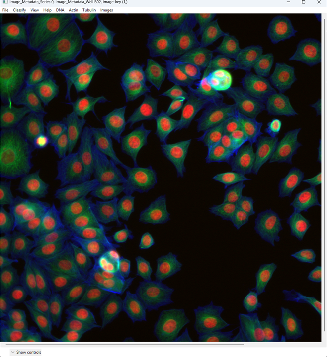
Viewing images in CellProfiler Analyst
CPA allows us to view quickly. This may seem pointless with only two images we are using here, but in a 384-well format you quickly find yourself with thousands of images, if multiple images were taken per well, making it difficult to get an overview of all images. This section will briefly take you through viewing images in CPA.
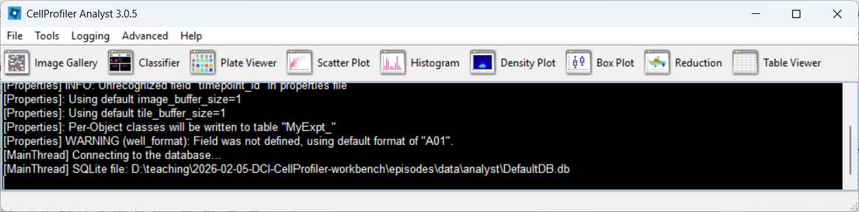
Load the properties file
Open CPA and load the .properties file by following the
images below.
CPA after launching: 
Selecting a properties file (use the downloaded one, after editing it
as described above): 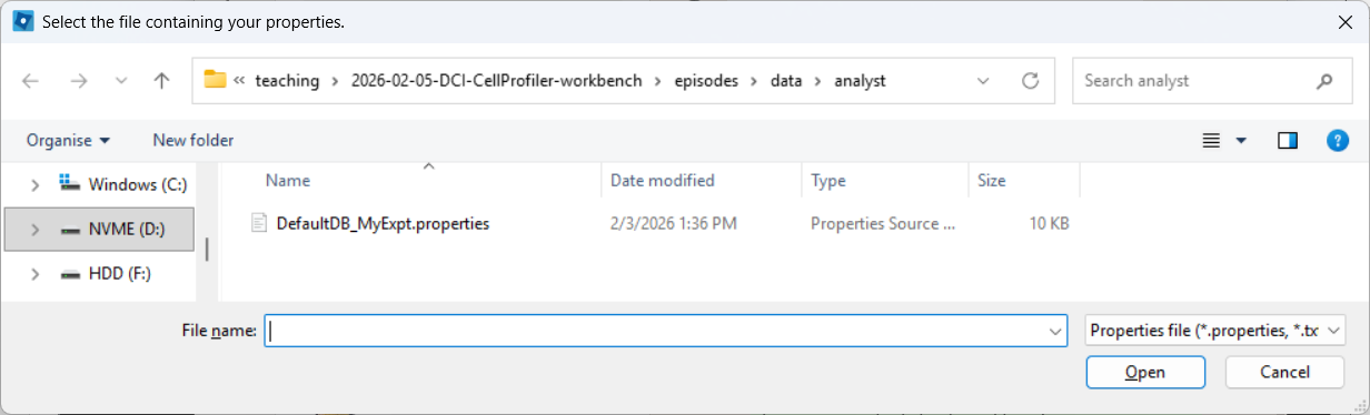
CPA after loading the properties file, if everything went well:
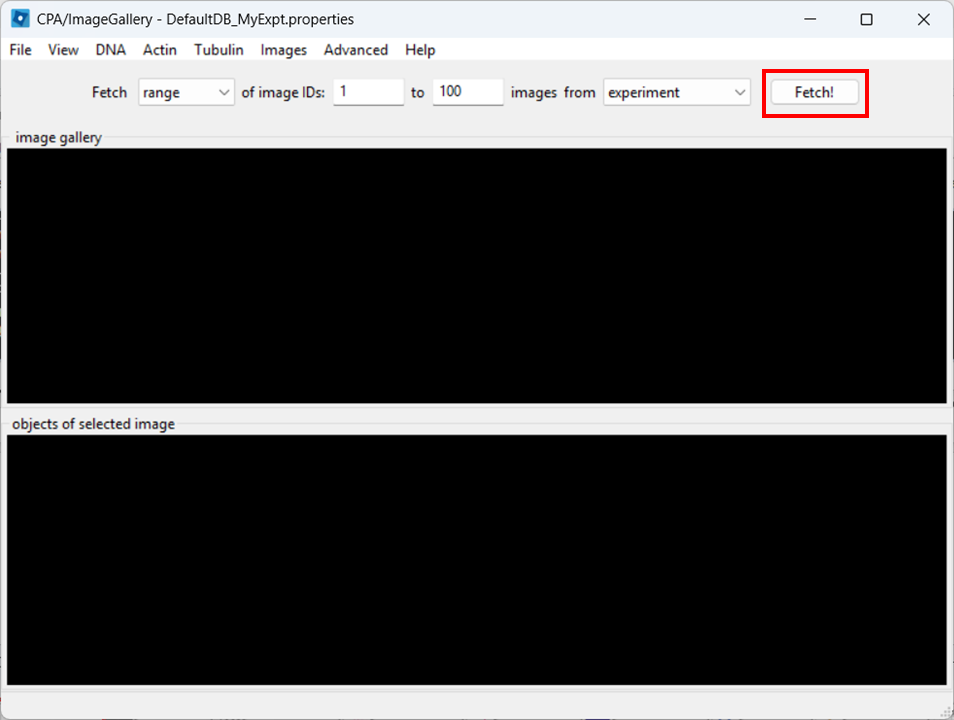
Open the Image Gallery tool
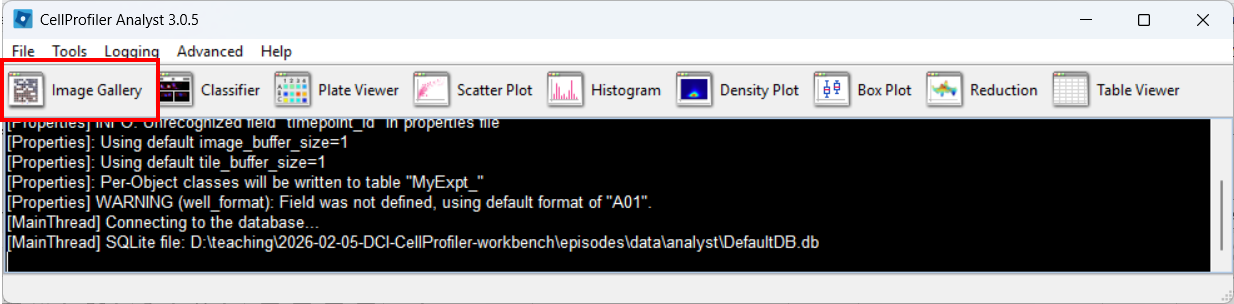
In CPA, open the Image Gallery. To do so, click on the Image Gallery tool:
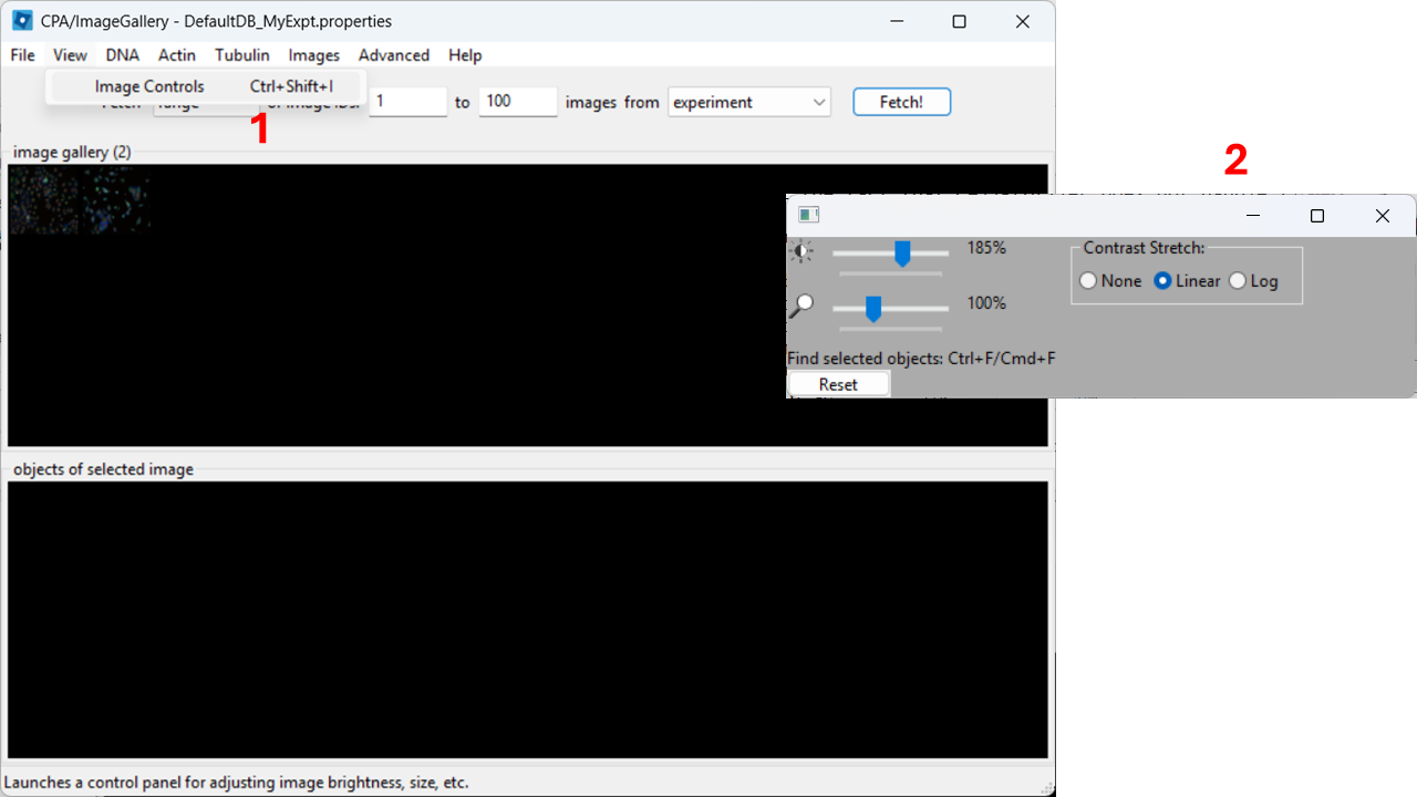
Adjust contrast
In the top menu, open View → Image Controls and increase contrast so cells are easier to see (e.g. 150-200% as a starting point).
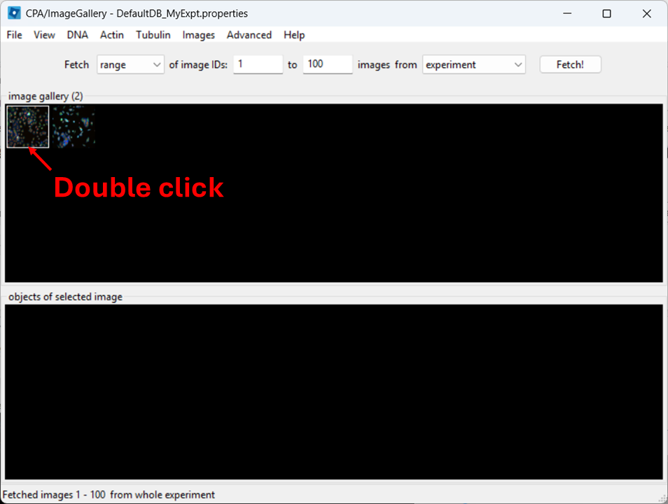
Open a full image
Close the controls window, then double-click a thumbnail to open the image:
When the image opens, CPA will assign colors to channels. You can change which dye maps to which color using the channel controls at the top.
Now examine what CPA is showing and how the channels are currently colored.
Change the channel colors by clicking the channel name/color controls.
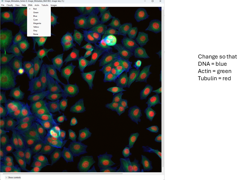
For this tutorial, map:
- DNA → blue
- Actin → green
- Tubulin → red
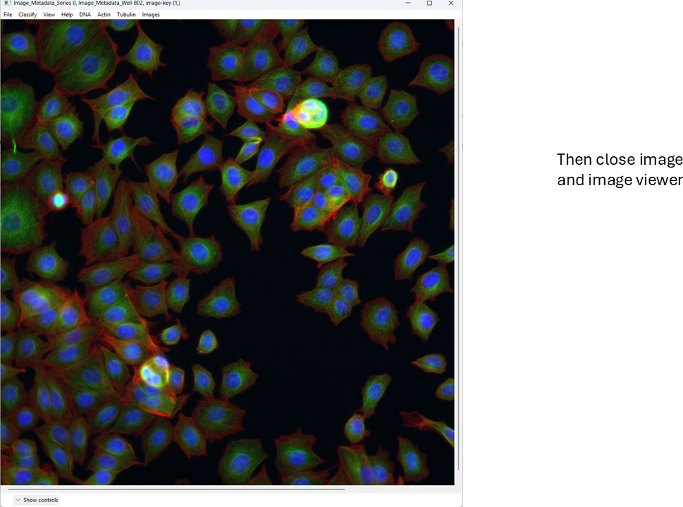
This is a basic overview of how you can quickly view images in CellProfiler Analyst. Next, we will move on to a more important task: classification.
Classifying cells with CellProfiler Analyst
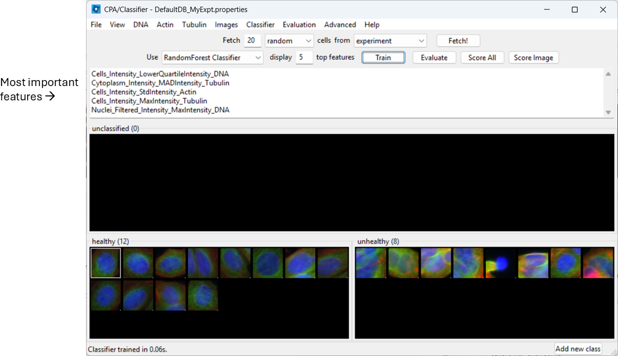
We will now train a simple two-class classifier. The exact labels are arbitrary; the point is to learn the workflow and see how classification quality depends on what examples you provide.
For this exercise, we will classify cells as healthy and unhealthy.
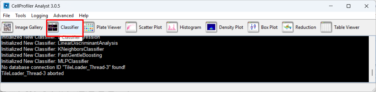
Open the Classifier tool
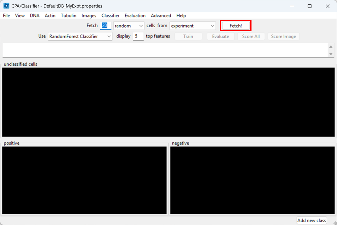
Open Classifier in CPA, then click Fetch! to load cell thumbnails.
As before, you may need to re-adjust visibility via View → Image Controls, and confirm your channel color mapping is still sensible.
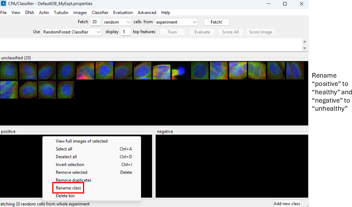
Rename classes
By default, CPA shows “positive” and “negative”. Rename them:
- Right-click the black box under positive → Rename class → Healthy
- Right-click the black box under negative → Rename class → Unhealthy
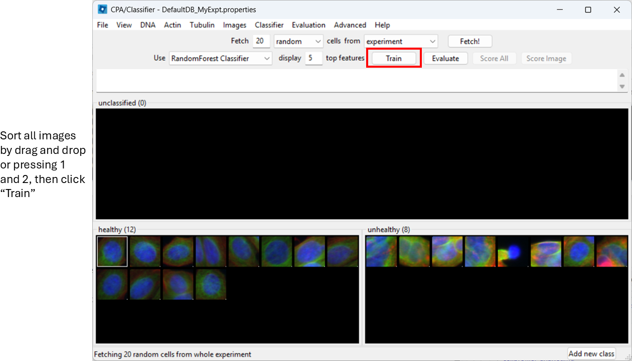
Label training examples
Now start sorting cells based on your judgement. You can drag-and-drop thumbnails into a class, or:
- select a thumbnail and press
1to assign Healthy - select a thumbnail and press
2to assign Unhealthy
Try to label at least ~20–50 examples total (more is better).
Agreeing on a definition on “healthy” and “unhealthy” will be impossible here, but in a more realistic biological setup we might identify, for example, rounded or elongated cells, which are more easily distinguished visually.
You can already train the classifier at this step by clicking
Train, however, it will be biased towards features with
large numeric range.
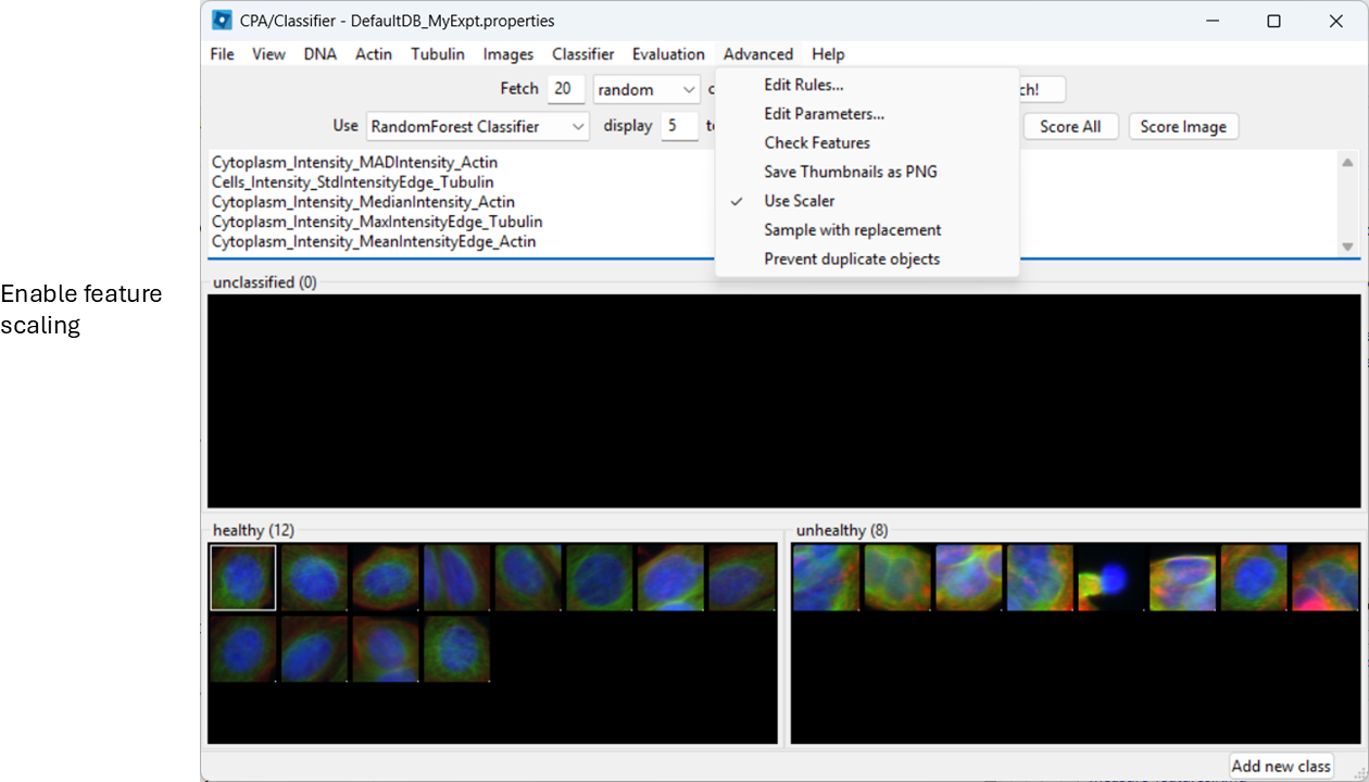
Enable feature scaling
To avoid features with large numeric ranges dominating the classifier, enable scalar normalization:
Advanced > Use Scalar
Train and inspect features
Train the classifier (button name may be “Train”, or training may happen automatically depending on your version/settings). CPA will show which measured features it is using.
Evaluate the classifier
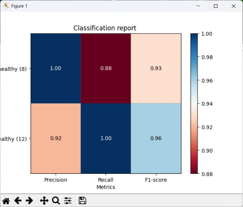
Next, we wish to check what the classifier is detecting in our two images. To do so, select:
Evaluation > Classification Report
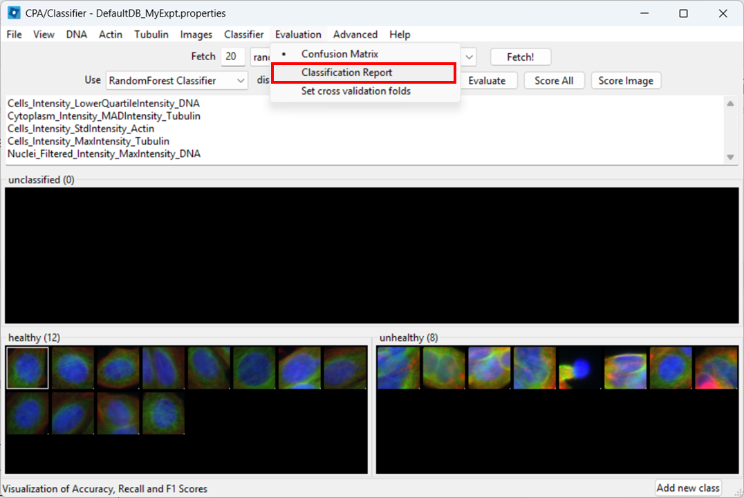
Then click Evaluate.
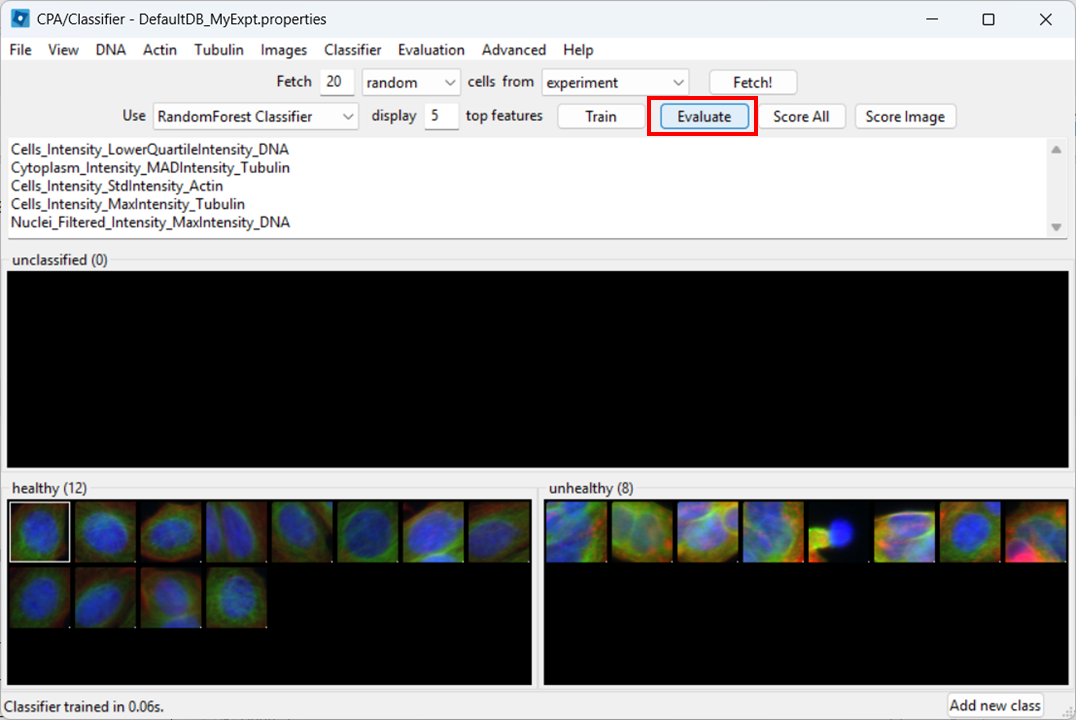
CPA will show a report with metrics such as precision, recall, and F1.
- Precision: of the cells predicted as Healthy, how many were labeled Healthy?
- Recall: of the labeled Healthy cells, how many did the classifier identify as sch?
- F1: a balanced score combining precision and recall (useful when classes are imbalanced, like here)
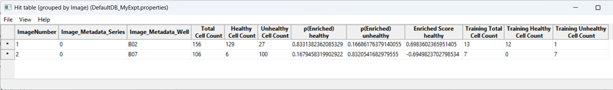
Score all images
As a further evaluation, we can predict phenotypes in all images using Score All.
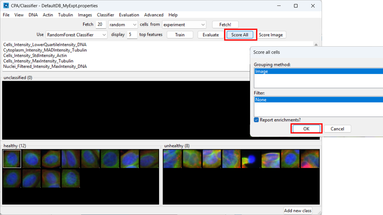
CPA will produce a table summarizing class enrichment per image/condition. In our dataset, you should see a trend consistent with the experiment: well B02 (i.e. DMSO) is (non-significantly) enriched for Healthy cells compared with cytoD-treated (B07) images.
Conclusions
You have now gone from segmentation and measurements (CellProfiler) to phenotype classification (CellProfiler Analyst). This workflow is powerful, but it only works well when:
- you have sufficiently descriptive features and
- there is a visual phenotype.
- CellProfiler Analyst can classify cellular phenotypes using the measurements exported by CellProfiler.
- The properties file tells CPA how to find and interpret your database and images.
- ExportToDatabase can generate CPA-ready outputs, but database may need extra filtering.
- Classifier performance depends heavily on consistent labels and representative training examples.