Bonus: visualising features
Last updated on 2026-03-31 | Edit this page
Estimated time: 12 minutes
Overview
Questions
- How do you read CellProfiler’s exports?
- What information can be gleamed from them?
Objectives
- Create a simple figure in Excel
- Using Morpheus to investigate how cytoD affects cell morphology
Finished with the previous steps already? Well done! In this episode we will dive into the data that CellProfiler outputs and start to get a feel for the problems we may face in analyzing it.
To start with, find the folder with the .csv files
created in the previous episode. There should be 5-6 files in the
folder, prefixed by whatever we set in the settings of the export
module.
-
Experiment.csvcontains basic information about the pipeline. -
Image.csvat its most basic just contains image indeces, although one can also export per-image features. - The remaining files are per-object, e.g.
Cells.csv. These represent features per single-cell and are perhaps the most interesting to analyse.
If you do not have an output file handy, you can download this one for the tutorial:
Open one of the files in Excel. Now we wish to check whether cytoD had any impact on cell morphology. Recall that cytoD is an actin inhibitor, so we may reasonably expect that cells will be smaller after treatment with cytoD.
Basic test of cell size in Excel
To test this, click on column “H” (Metadata_Treatment) to select it.
Then, while keeping the Ctrl key (Command ⌘ on Mac) pressed
, click on column “J” (AreaShape_Area). In the top, go to
Insert > Recommended charts and select the
top one (Clustered Column), then press Okay.
By default, this gives us a sum of pixels covered by cells in each
treatment. To change it to the more meaningful average (i.e. size of
cell on average per treatment), click on the graph, then in the bottom
right under Values click on the
Sum of AreaShape_Area, then
Value Field Settings. In the pop up window, select
Average and press Okay. What does the chart
show?
You should get a table and bar chart similar to this: 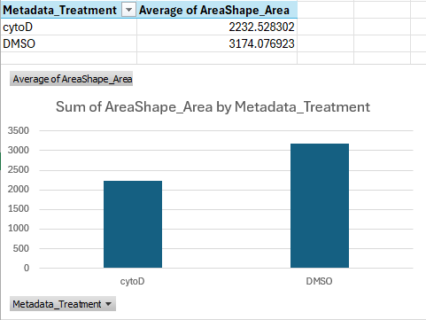
If we do the math, this shows that cells treated with cytoD are about ~30 percent points smaller than cells treated with DMSO only, on average.
This is a great start, we can see that our treatment is indeed having a quantifiable effect! But how can we check this for all features, ideally in an automated way? And how can we skip the averaging that Excel is doing here entirely, and cluster single-cells?
Advanced analysis
Depending on your expertise with programming, you have a few options. If you
- would like to just see a quick result, skip to the next section
- have experience in Python programming, use pycytominer, a Python package that can be used to the analyse morphological features.
- have no experience in Python yet but would like to learn, attend our future Python workshop!
- would like help to analyse your results in depth, contact us!
Analysis with Morpheus
One useful tool to visualize CellProfiler outputs is Morpheus: https://software.broadinstitute.org/morpheus/
Morpheus is a matrix visualization tool that can quickly cluster rows and columns.
To see it in action, first download the sample input below, which we created from a CellProfiler output. Note that CellProfiler output cannot be loaded into Morpheus straight, but requires some preprocessing, which in this case we did for you using Python.
Then open https://software.broadinstitute.org/morpheus/ and drop the file into Morpheus. You should now have a view like this:
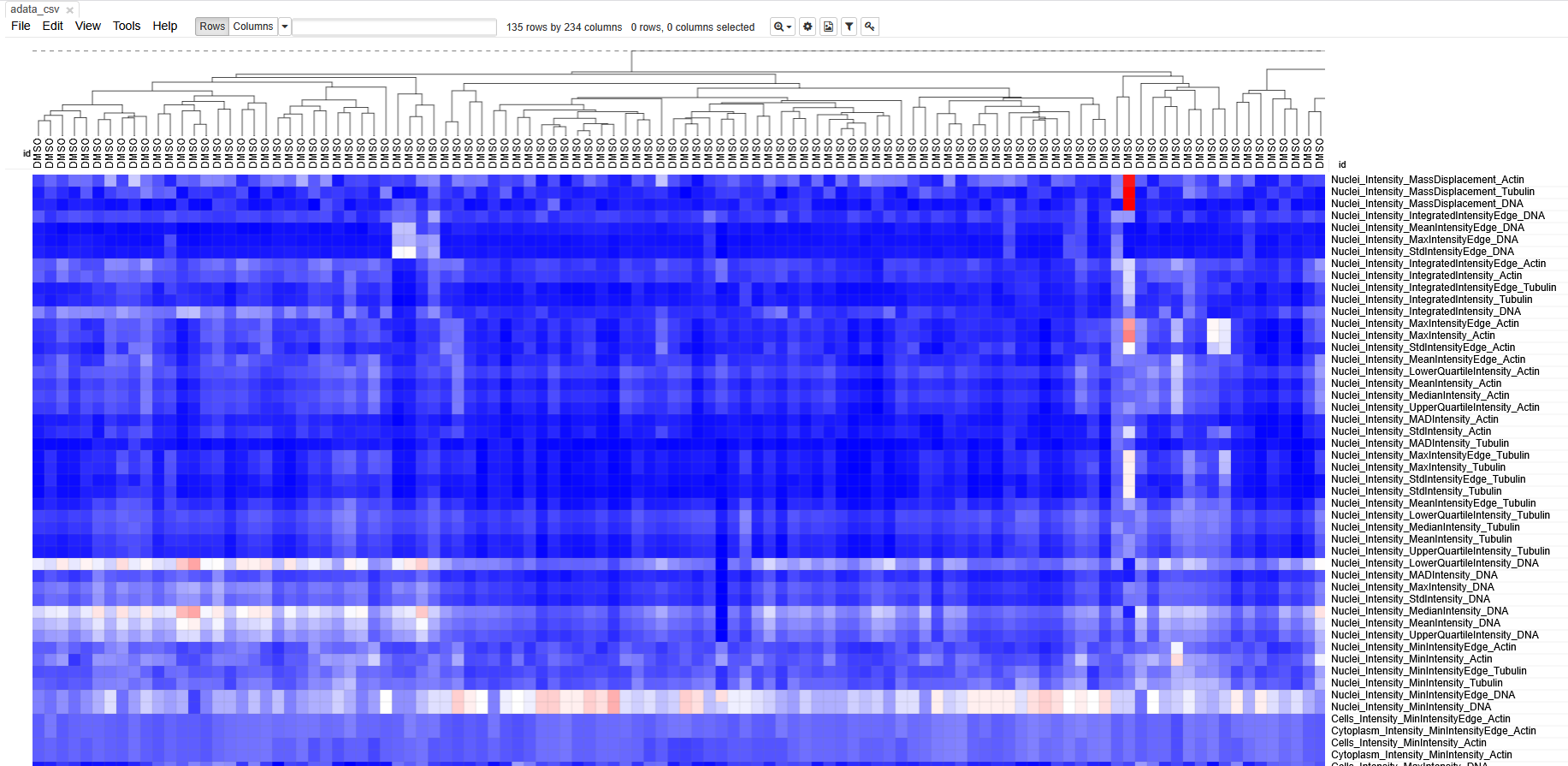 Each column represents measurements from a single cell. Each row
represents a measurement. The boxes are color coded by the feature value
for this cell (after some normalization). Cells (columns) are clustered
based on similarity to each other.
Each column represents measurements from a single cell. Each row
represents a measurement. The boxes are color coded by the feature value
for this cell (after some normalization). Cells (columns) are clustered
based on similarity to each other.
Spend some time getting acquainted with the interface. Can you identify which cells belonged to which treatment? Do the cells cluster separately? Which features seem to have changed after treatment with cytoD?
Unfortunately, preparing an input file for Morpheus is not very straightforward, because it involves some normalization and, in bigger experiments, batch correction steps. It would also not be suitable for experiments with more than a few hundred cells, because you will quickly lose sight of the large data.
Therefore, we recommend contacting DBI-INFRA if you would like to learn more:
- CellProfiler writes one
.csvper object type (i.e. Nuclei, Cells, Cytoplasm). - Exported files contain many columns with metadata.
- Morpheus can be useful to interrogate morphological changes.