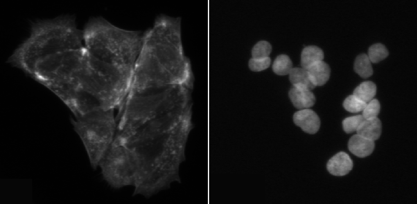
Image 1 of 1: ‘Side by side image of cells stained for microtubules and nuclei. Nuclei are more easily discerned from each other.’
Often, identifying cells is easier with a
nuclear rather than an intracellular stain. Left: Cells stained for
microtubules, right: DAPI-stained nuclei.
Figure 2
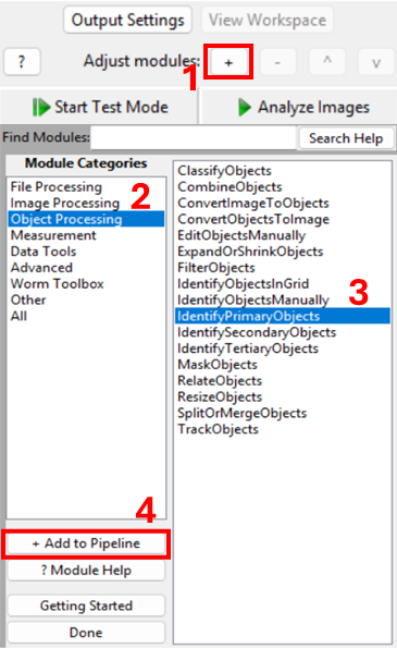
Image 1 of 1: ‘Screenshots of CellProfiler, showing how to add the IdentifyPrimaryObjects module.’
Figure 3
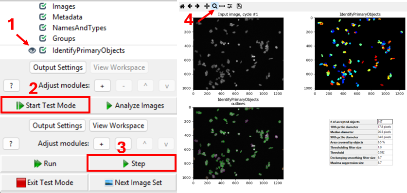
Image 1 of 1: ‘Screenshots of CellProfiler, showing how to use the test interface to see which channel is being segmented.’
One way to verify the image that is being segmented is to use
CellProfiler’s interactive test interface. To do this, first make sure
the eye symbol next to the module is enabled (dark). If it is a disabled
(light grey), click on the eye (step 1 in the figure below). Second,
start test mode and run the first step. A new CellProfiler window will
open, that shows the image that is being segmented next to the
segmentation results. Do the objects in the top left image look like
nuclei? You can zoom in using the magnifying glass (step 4 in figure).
Figure 4
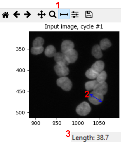
Image 1 of 1: ‘Screenshots of CellProfiler showing that nuclei diameters can be estimated using the measurement tool.’
Figure 5
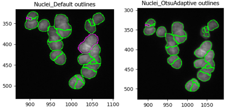
Image 1 of 1: ‘Side by side comparison of segmentation results with different segmentation strategies’
In this dataset, as if often the case, it is difficult finding
perfect settings! Ideally, one spends a significant portion of time
optimizing the settings to make sure that results are biologically
representative of cells. In the figure below, you can see that changing
the segmentation strategy and method to Adaptive and
Otsu, respectively, may not make much of a difference. But
results of the segmentation with adaptive Otsu show that some pixels
that are parts of nuclei are discarded (top right). Note that the result
will also be affected by the settings we will change next.
Figure 6
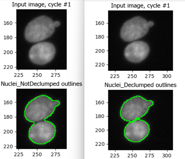
Image 1 of 1: ‘Enabling declumping can help discern nearby nuclei.’
This figure shows the impact of not using declumping at all (left) vs
declumping using Shape (right).
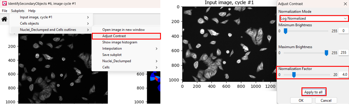
Image 1 of 1: ‘Screenshots showing that contrast be adjusted using Subplots > (Object name) outlines > Adjust Contrast and selecting Log normalized and a normalization factor in the range of 2-5, the clicking Apply to all.’
If you find the contrast too dim to see the channel well, you can
increase the contrast. You can do so either by right clicking >
Adjust Contrast, or by selecting
Subplots > (Object name) outlines > Adjust Contrast.
Then, select Log normalized and a
normalization factor that you deem suitable, the click
Apply to all.
Figure 2
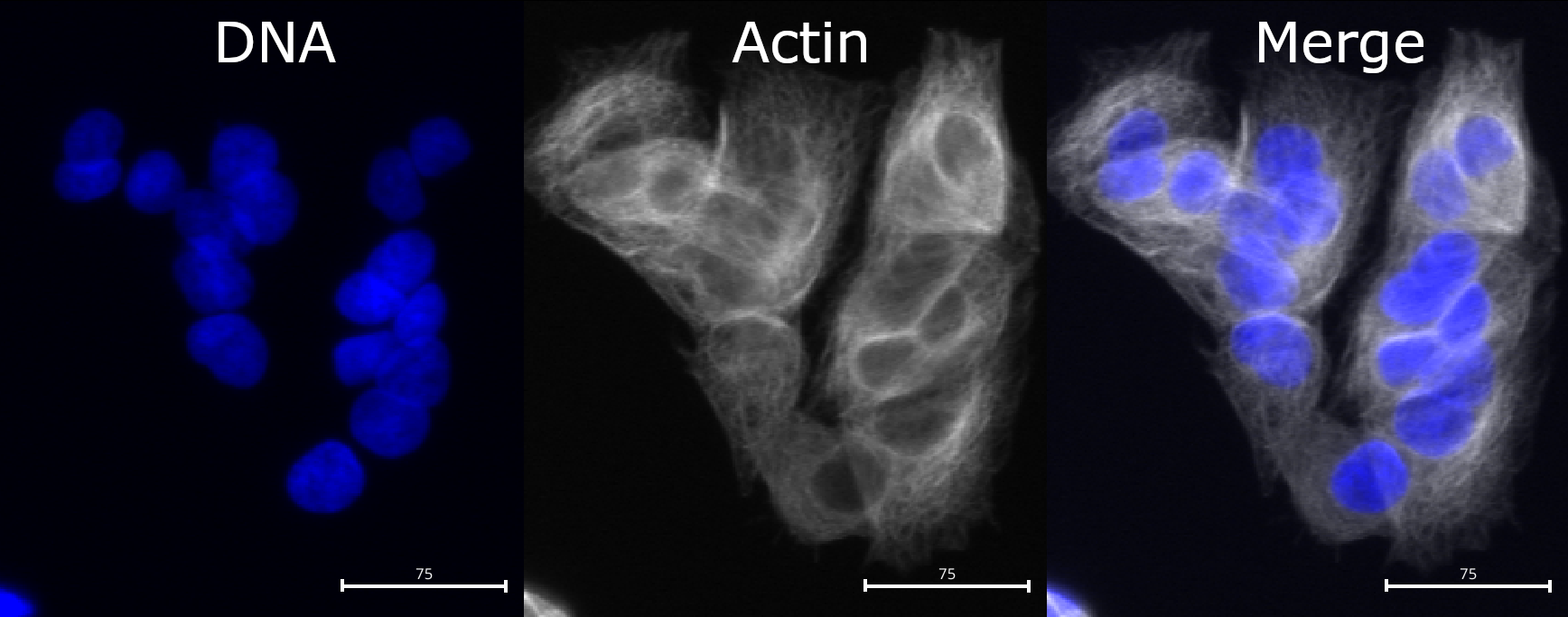
Image 1 of 1: ‘Picture of cells, with DNA stain shown in blue and actin stain shown in gray. While nuclei are fairly well separated, cell boundaries are touching in many places and are not easily distinguished.’
Compared to nuclei, cell boundaries are often less easily
distinguished. We can see that the actin channel does increase at cell
junctions, which should help in segmenting the cells in later steps. But
it is important to keep in mind that any segmentation will not be
perfect here: after all, where would you draw the boundaries by hand?
Figure 3
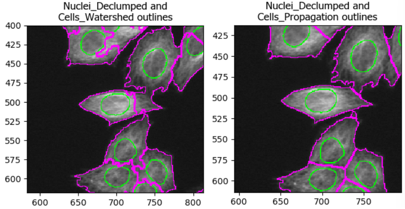
Image 1 of 1: ‘Comparing two methods of identifying cell boundaries: watershed and propagation. Using watershed, some cell boundaries spill over into adjacent cells, leading to incorrect cell masks.’
As with the segmentation of nuclei, getting cell segmentation right
can be tricky. Often, starting with propagation as method
is a good starting point, because watershed can expand into neighboring
cells (see below). But you can certainly find areas of the image where
the reverse is true. This means that, once again, choices should be made
carefully.
Figure 4
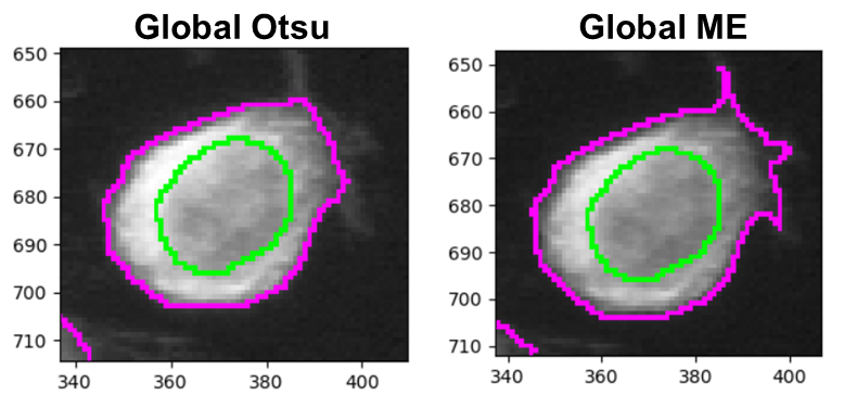
Image 1 of 1: ‘Side-by-side of Otsu and minimum cross-entropy thresholding results.’
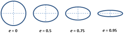
Image 1 of 1: ‘Circles that are increasingly stretched into long ovals. Beneath the circles are values for eccentricity, which go from 0 (perfect circle) toward 1 (extremely stretched oval).’
CellProfiler measures many things - including some with names that
most will never have heard of. The helps a lot with deciphering the
measurement names. For example, for eccentricity it
contains this helpful image:
Which shows that eccentricity will be higher for elongated cells.
You share one of the two files by clicking on the +. Note that toffeeshare only allows sharing
one file at a time. You can zip the two files to an archive to only
share one file if you prefer, in which case skip step 7.
Figure 2
Image 1 of 1: ‘Toffeeshare website sharing options’
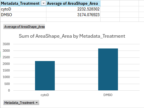
Image 1 of 1: ‘Bar graph showing that cells treated with cytoD are about ~30 percent points smaller than cells treated with DMSO only, on average.’
You should get a table and bar chart similar to this:
Figure 2
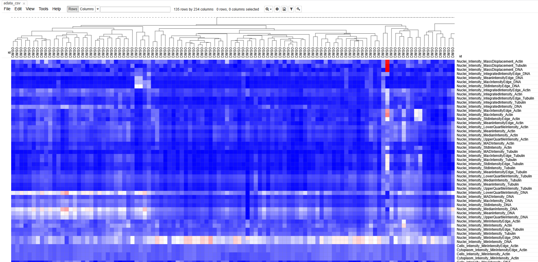
Image 1 of 1: ‘Screenshot of morpheus, showing a heatmap with cells in columns and features in rows.’
Each column represents measurements from a single cell. Each row
represents a measurement. The boxes are color coded by the feature value
for this cell (after some normalization). Cells (columns) are clustered
based on similarity to each other.
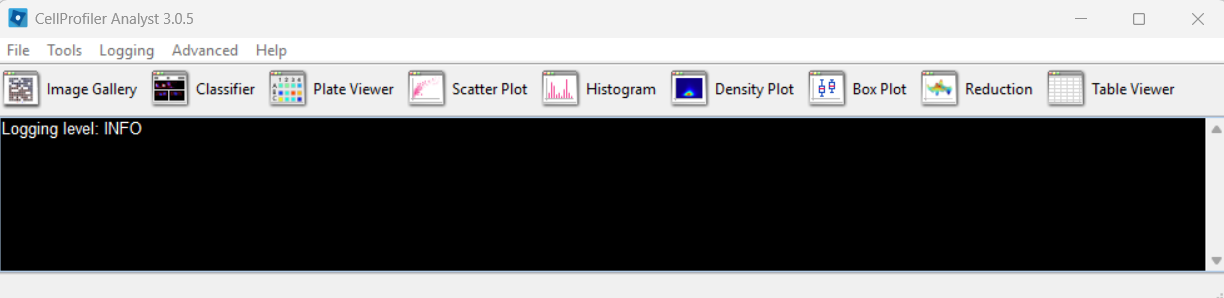
Image 1 of 1: ‘CellProfiler Analyst start screen indicating that a properties file must be loaded to begin.’
CPA after launching:
Figure 2
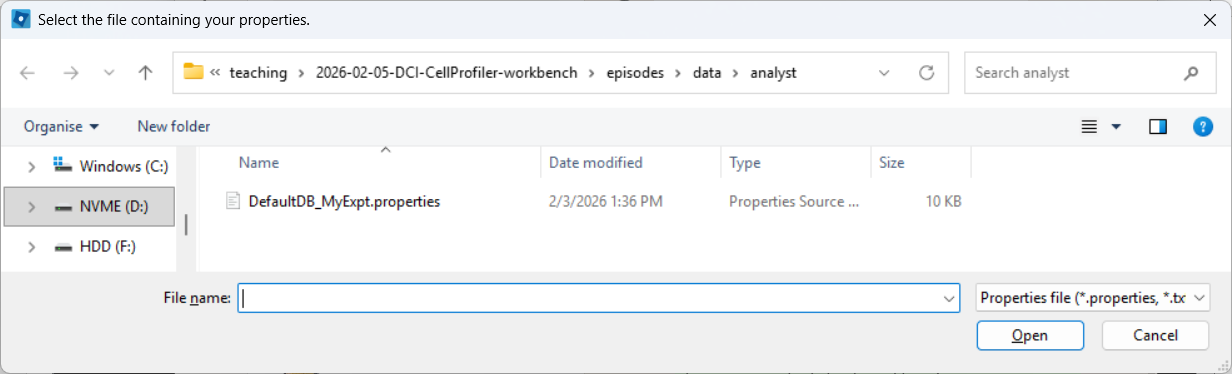
Image 1 of 1: ‘File selection dialog in CellProfiler Analyst used to browse to and select a .properties file.’
Selecting a properties file (use the downloaded one, after editing it
as described above):
Figure 3
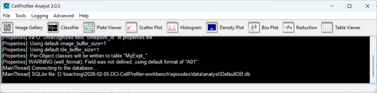
Image 1 of 1: ‘CellProfiler Analyst main window after loading a properties file, showing that the experiment is ready to browse.’
CPA after loading the properties file, if everything went well:
Figure 4
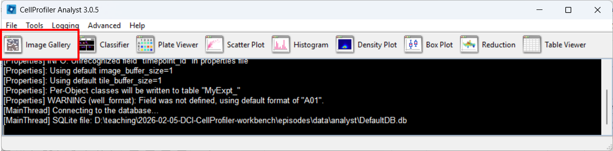
Image 1 of 1: ‘CellProfiler Analyst menu/navigation highlighting the Image Gallery tool.’
Figure 5
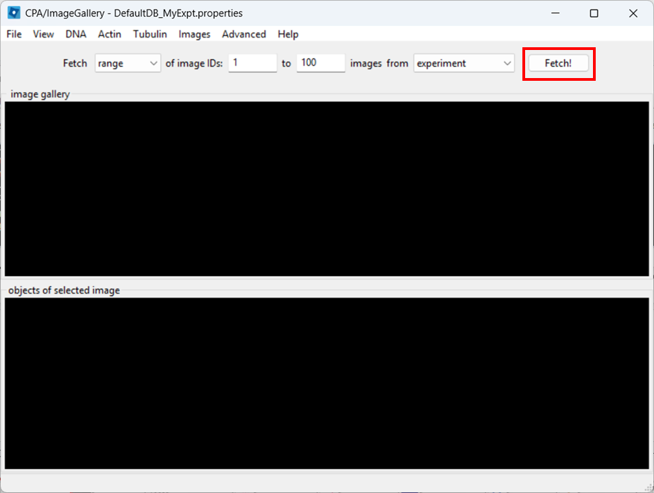
Image 1 of 1: ‘Image Gallery in CellProfiler Analyst with the Fetch button highlighted to load image thumbnails from the database.’
Figure 6
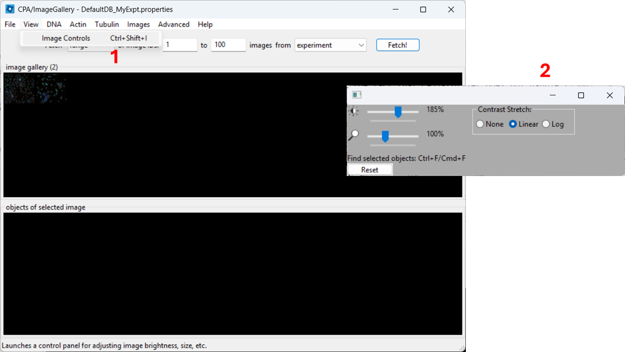
Image 1 of 1: ‘Image Controls window in CellProfiler Analyst showing sliders for contrast adjustments.’
Figure 7
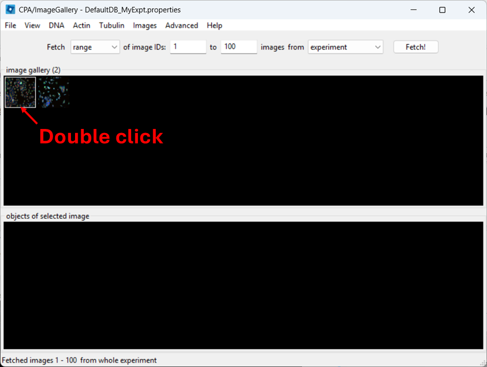
Image 1 of 1: ‘CellProfiler Analyst showing a selected thumbnail in the Image Gallery ready to be opened by double-clicking.’
Figure 8
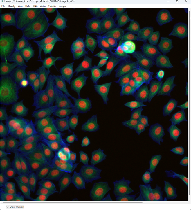
Image 1 of 1: ‘Opened multi-channel microscopy image in CellProfiler Analyst with default color assignments and visible nuclei and cell bodies.’
Figure 9
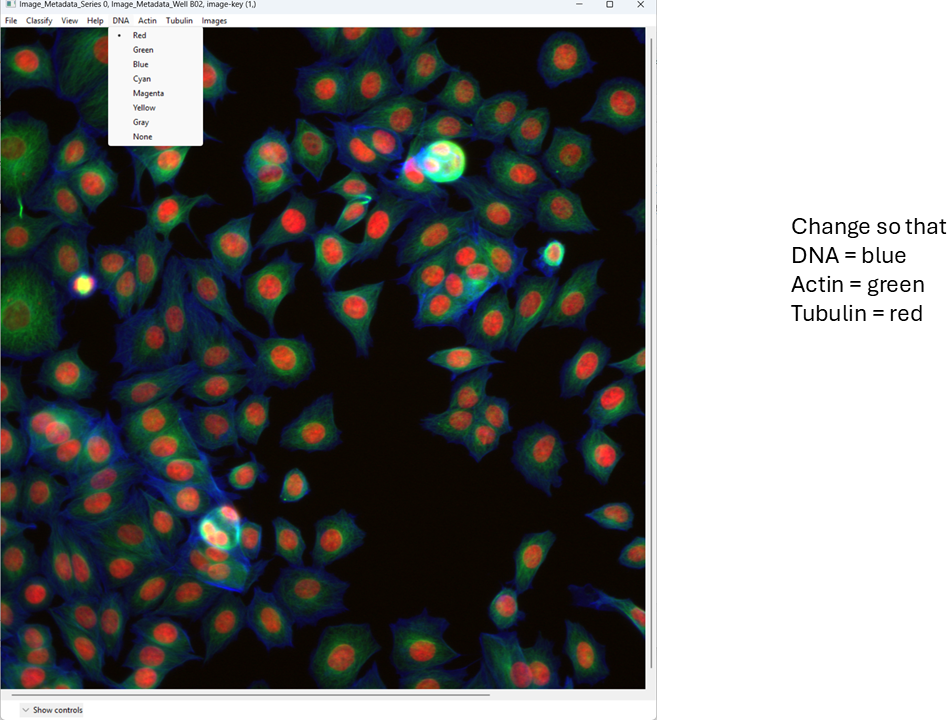
Image 1 of 1: ‘CellProfiler Analyst channel color controls highlighted, showing where to click to change channel-to-color mapping.’
Figure 10
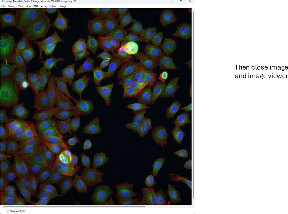
Image 1 of 1: ‘Multi-channel image in CellProfiler Analyst after setting DNA to blue, actin to green, and tubulin to red.’
Figure 11
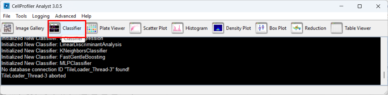
Image 1 of 1: ‘CellProfiler Analyst main window with the Classifier tool highlighted.’
Figure 12
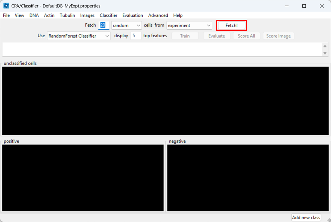
Image 1 of 1: ‘Classifier interface in CellProfiler Analyst showing the Fetch button used to load candidate cell thumbnails for training.’
Figure 13
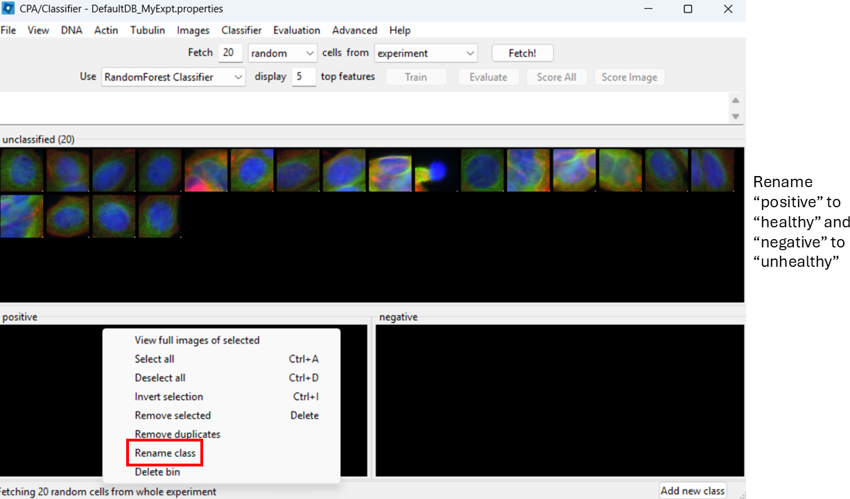
Image 1 of 1: ‘Classifier training panel showing the default positive/negative classes and the option to rename them.’
Figure 14
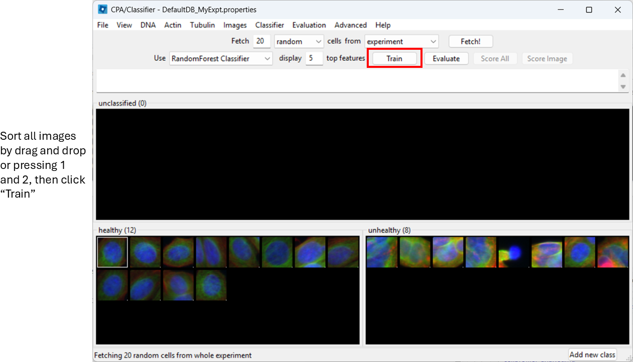
Image 1 of 1: ‘CellProfiler Analyst classifier training view showing thumbnails being assigned to the Healthy and Unhealthy classes.’
Figure 15
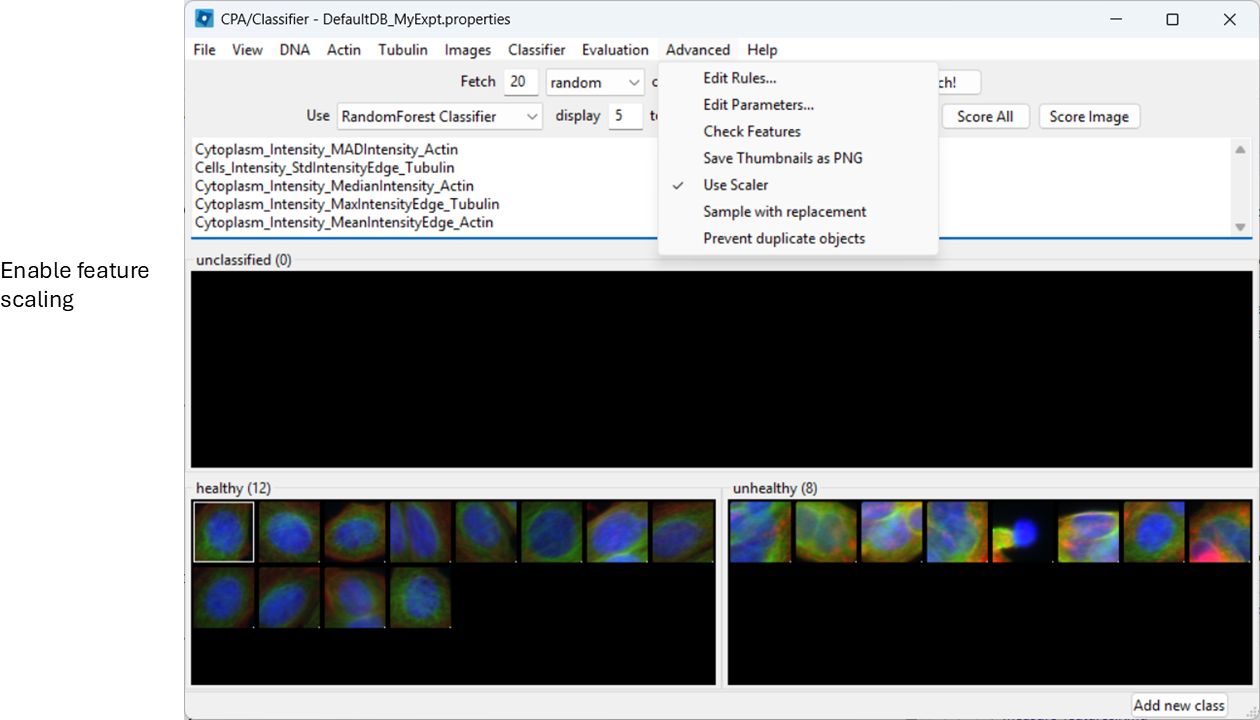
Image 1 of 1: ‘CellProfiler Analyst Advanced settings menu showing the Use Scalar option enabled for feature scaling.’
Figure 16
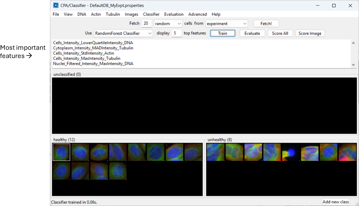
Image 1 of 1: ‘Classifier interface showing model training results and a ranked list of influential features used for classification.’
Figure 17
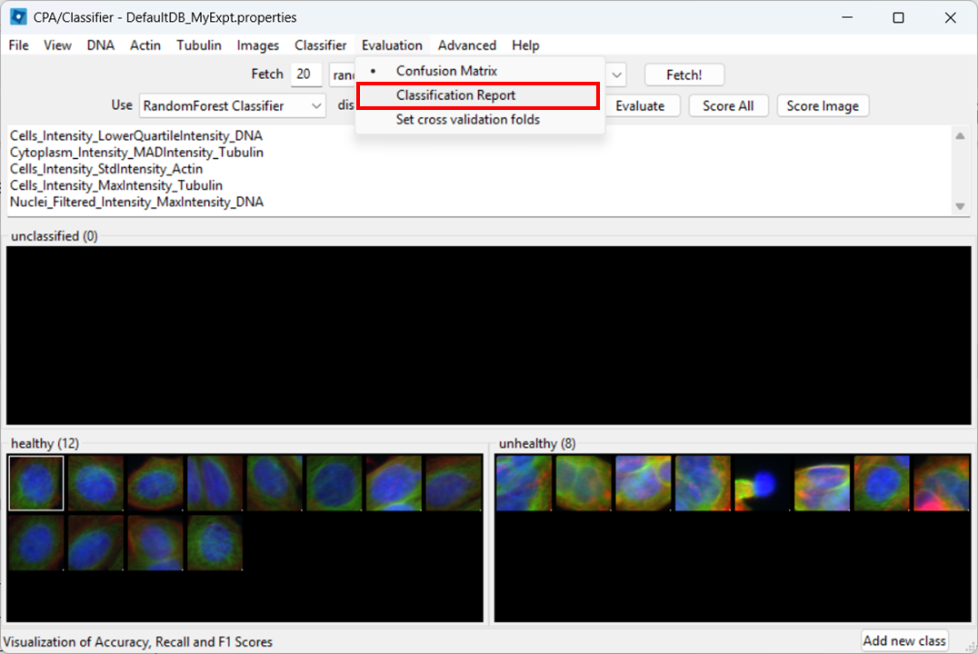
Image 1 of 1: ‘CellProfiler Analyst Evaluation menu with the Classification Report option highlighted.’
Figure 18
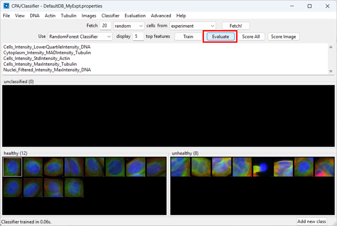
Image 1 of 1: ‘Classifier evaluation panel with the Evaluate button highlighted to generate a classification report.’
Figure 19
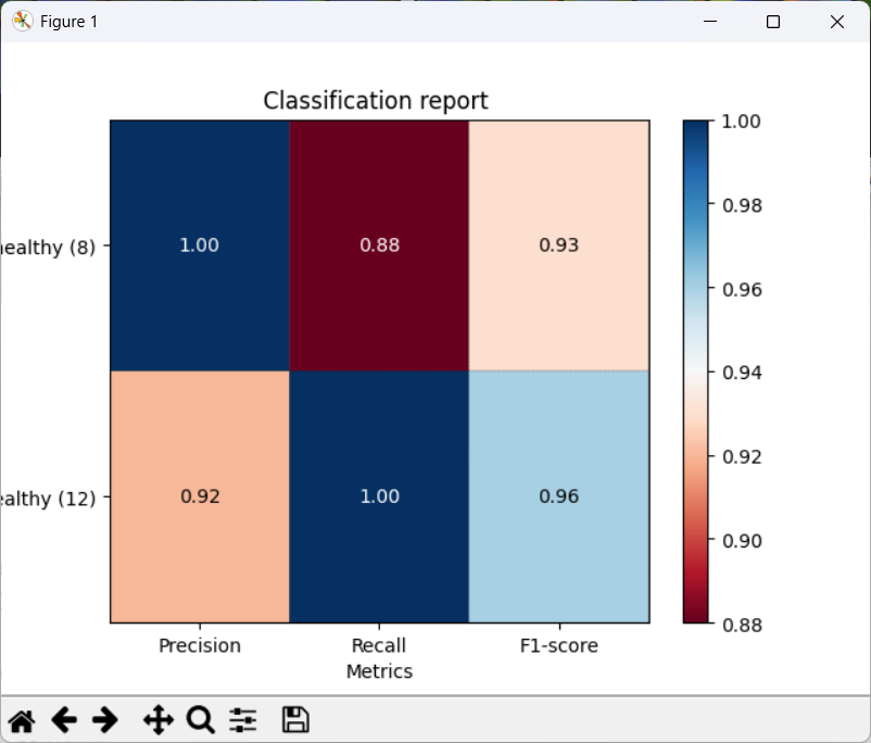
Image 1 of 1: ‘Classification report window showing metrics including precision, recall, and F1 score for Healthy and Unhealthy classes.’
Figure 20
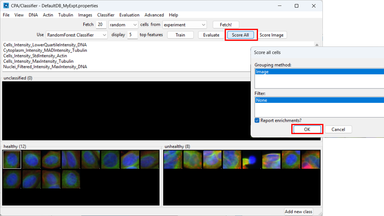
Image 1 of 1: ‘CellProfiler Analyst classifier interface with the Score All option highlighted to apply the classifier to all images.’
Figure 21
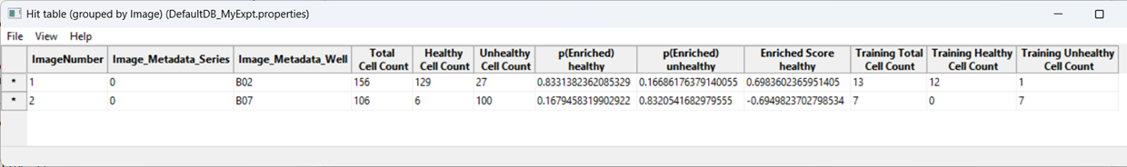
Image 1 of 1: ‘Results table in CellProfiler Analyst showing per-image or per-condition counts/enrichment of Healthy versus Unhealthy classified cells.’
Figure 22
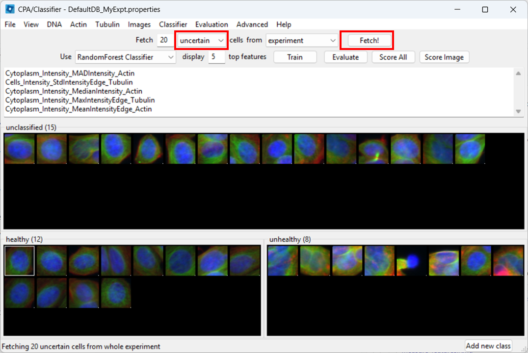
Image 1 of 1: ‘CellProfiler Analyst view with option to fetch uncertain predictions highlighted.’
 Which shows that eccentricity will be higher for elongated cells.
 . Note that toffeeshare only allows sharing
one file at a time. You can zip the two files to an archive to only
share one file if you prefer, in which case skip step 7.
. Note that toffeeshare only allows sharing
one file at a time. You can zip the two files to an archive to only
share one file if you prefer, in which case skip step 7.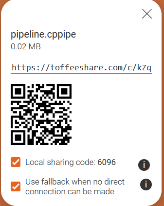
 Each column represents measurements from a single cell. Each row
represents a measurement. The boxes are color coded by the feature value
for this cell (after some normalization). Cells (columns) are clustered
based on similarity to each other.
Each column represents measurements from a single cell. Each row
represents a measurement. The boxes are color coded by the feature value
for this cell (after some normalization). Cells (columns) are clustered
based on similarity to each other.